Description:
-Prestige Clothing-
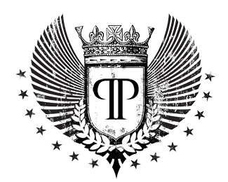
I wanted to create something really classy, representing royalty and sophistication while keeping a little urban dirty touch.
I opted for a black/white colors scheme, keeping it really traditionnal.
As for the typo, I use a custom font for the Ps and modified it to give a really sharp edge-cutting look.
Status:
Nothing set
Viewed:
1990
Share:
Lets Discuss
this is nice....my only concern is it scable?...if this has to be sticthed on any of the clothing it could be tricky...but its nice its smacks of sophistication...I'm working on a mens clothing label as we speak and its nice and refreshing to see this, it has inspired me.
ReplyThe actual size of the logo is 30cm wide by 15cm.%0D*%0D*To be honest, I first designed it for a tattoo, then thought it would looks cool for my first logo!
Replyi like it too.*it%B4s just getting hard to get that on a shirt**good job
Replyif you're screen printing, that would work fine at 30cm x 15 cm, provided your mesh is fine enough!
ReplyI'm throwing down a %22holy-crap this is amazing%22 scalable issues aside. Though you should look into a secondary version for smaller sizes.
ReplyI think it works better without those stars, or perhaps less stars. They add a lot of noise and draw your attention away from the 2 P's, I think thats where you want to focus the attention?**I really like the flow of those 'wings'.
ReplyOutstanding work! Congratulations!
Replythis is -sweet-!
ReplyVery nice, reminds me of the one I did for Polished to Perfection:**http://logopond.com/gallery/detail/10006
ReplyPlease login/signup to make a comment, registration is easy