Float
(Floaters:
0 )
Description:
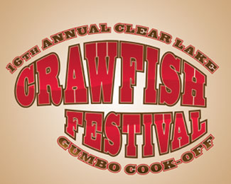
Proposal logo for the annual Clear Lake Crawfish Festival
Status:
Unused proposal
Viewed:
1444
Share:
Lets Discuss
Would love some feedback.
ReplyI think if you are going to have the double outline around the text, I would go with a less heavier font.%0D*%0D*Why is %22Crawfish%22 not centered with %22Festival%22?
ReplyThanks for commenting. %22Crawfish%22 and %22Festival%22 are misaligned because it's suppose to look like a claw. %22Festival%22 represents the small pincher.
ReplyHmmm, that makes sense. what about actually illustrating the claw and reversing the text out of it?
ReplyPlease login/signup to make a comment, registration is easy