Description:
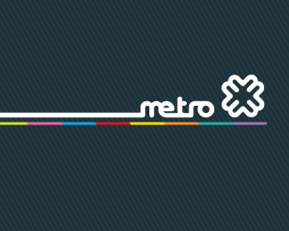
Metro Hamburg is a CI and communication concept for the local public transport of Hamburg/Germany. The logo is visually borrowed by the form of a tram. The cross is the keyvisual. It contains 8 arms, standing for 8 lines in the public transport system. Additionally it contains four arrows from every direction.
As seen on:
HTK-Hamburg
Status:
Nothing set
Viewed:
13249
Share:


Lets Discuss
I really like this design. It has a very nice appeal and seems to fit the target audience and market accrodingly. However when I saw this in the thumbnail form I read it as %22retro%22, but after taking a second look, it read correctly. Once again nice job. :)
ReplyVery nice work. Congratulations. Good balance between design and marketing.
ReplyThats a very nice piece of branding!
ReplyThanx for all your comments. Nice showcase Fabian! The metro project features a lot of more stuff. Its showed on my website soon...%3B-)
ReplyThis appears to have come before Euan's mark...too close?
Replyyah joe, i was going to say that
ReplyIs this a student project or an actual proposal?
ReplyI think it is clever that you have managed to incorporate so many ideas within a logo from the 8 arms to the arrows and tram shape. Usually trying to add lots of concepts does not work but in this case it works really well. I really like that you added the colourful line too, great design.
ReplyBeautiful!!! I love the bar of colors.
Replynice....!!!
ReplyWhat font is that?
ReplyPlease login/signup to make a comment, registration is easy