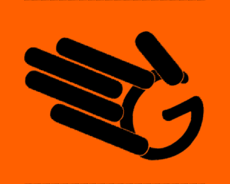
Description:
A WIP.http://logopond.com/logos/09ad8ca9c8cb734d5d6aa20e099b895e.png
As seen on:
Youtube.com/GeekSlap
Status:
Work in progress
Viewed:
958
Tags:
gaming
•
technology
•
GeekSlap
•
Slap
Share:
Lets Discuss
I would love some critique guys lay it on thick :)
Replytake off the shadow, take off the outlines, get a rounded version of the G and make the fingers the same width as the width of the stroke of the G, then revolve the fingers to the left so the thumb doesn\'t close the G.
ReplyWhat did you mean by take off the outline I did everything else I believe
Replythere appears to be an outline around the fingers. that is probably the worst rounded G you could find. definitely don\'t want anything that looks hand drawn or italic, unless you change the fingers to the same style. you also still need to make the width of the stroke of the G the same width as the fingers. and the fingers shouldn\'t stick out past the G into the palm. the problem is this looks like you drew rounded lines and stuck them onto a bad G. you want the G and the \"fingers\" to look like they belong together. this does not look like it took any work at all. a good icon, depending how good and fast you are, takes hours, if not days, to develop.
ReplyPlease login/signup to make a comment, registration is easy