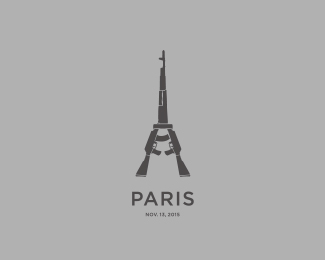
Description:
Paris | November 13, 2015
Status:
Unused proposal
Viewed:
3271
Tags:
terrorism
•
kalashnikov
•
gun
•
tower
Share:



Lets Discuss
This is sending the wrong message, I think.
ReplySeriously?!
ReplyLogo is more description of what happened in Paris, than message
ReplyI concur ^
ReplyI am eager to find out about wrong message tho... Sam? Gareth?
ReplyWhy does what happened in Paris need a logo? I don't think it's a difficult question to answer.
ReplyIt's redefining the Eiffel tower. The peace symbol I think sends a better message than guns.
ReplyThis is not a classic logo
Reply@logoholik, this mark is combining two opposing symbols, one essentially "good" and one essentially "evil". When you combine them and make them one, you are basically saying they are one in the same. Two sides of the same coin. But that's not an accurate description of the events at all. In reality, it was evil attacking good, terrorists attacking innocent people. It's not fair to elevate the symbol of evil to that of the symbol of Paris. It's confusing at the very least, and potentially offensive to many. Jean Jullien combined a peace sign and the Eiffel Tower to create a beautiful symbol and message of Peace for Paris.
ReplyThis logo is meant to show a danger of terrorism, what else?
ReplyI'm sorry, but this is pointless.
ReplyTo me, this would be appropriate only if France was somehow terrorizing another nation. In my opinion it completely sends the wrong message, and it was a weird gallery add to say the least... You have a good style, but this is a weird concept.
ReplyLearn from this guys.
ReplyWhilst 2 guns together do look a bit like the Eiffel tower - and whilst the designer obviously knows how to lay things out in a tidy fashion using a design program - this design lacks 2 vital ingredients for what is required at this time: empathy and respect. Whether this oversight is intentional or not, we need to think beyond our ability to make related items fit just because they "can" - especially with a subject matter so loaded with raw emotion. We're not talking about a logo for a company that sells cakes, this is a design to mark a two day old event where innocent people have died, families have been torn apart, and lives ruined.
If you want to see a mark that has been properly thought out then see https://twitter.com/jean_jullien/status/665305363500011521. The style gives it a universal accessibility - no need for a computer and design program. You can create it yourself with little technical ability, on any surface using any tool. It's for everyone. It also says the right thing, it can't be misinterpreted, and it doesn't make judgement. It's a symbol of support, and - to put bluntly - not a reminder of what type of weapon was used in the execution of innocent lives.
Like I said, I don't think there is disrespectful intention with this design, but this is a good example of our responsibility to think further than surface cleverness and eye for layout.
This is just the Japan tsunami "logo" thing all over again, nothing personal against you Graforidza, but I find stuff like this (I acknowledge you're not the only one doing it) in poor taste.
ReplyTotally agree with Sam, luberadesign, ru_ferret, etc.
ReplyIf there ever was an advert for what is wrong in design this would be it ... if you truly dont understand what you have posted and can truly warrant yourself putting this up (and being put in the gallery) - i'm truly disgusted by the lack of respect and blatant ignorance. As Kev said you may think its clever as a concept - however use your moral compass and think of your context ....
ReplyThere is a date in the bottom of logo which reminds to this terrible act of violence. It shows what terrorist tried to do with Paris in that particular day. But of course they didn't and thay will not. That is the only message.
ReplyMaybe it's a new perspective on the current Gun laws in Paris/France..? Maybe not in the best taste, But it does send a message.
ReplyWonder How well ISIS would do In Places like Idaho and Montana here if they attacked?
ReplyVisual description, is not all about cute little puppy dogs, and cute little elephants to convey a message, It's all about how you see it....? Not a logo for sure.
ReplyIf I created One It might be 2 Samurai swords coming together to form the Eiffel tower, with a dagger crossing to stab ISIS in the heart and to decapatate ISIS.
ReplyI think the slogan should be the two hands together and the statement saying "Pray For Justice".
ReplyCapitalism. Still alive.
Reply@ru_ferret the article you linked to is actually saying the opposite of what you said: It is Jean Jullien's work, not Banksy's.
ReplyI think @kevadamson summed it up perfectly.
Removed...
ReplyAs I sad before, this is not a classic logo, it's more related to some poster message for an exibition of what happened that day. I agree it's not for home page. Thank you all for your comments but still I hope you understand that my intentions was just to make an expression of terrible act that happened in Paris.
ReplyPlease login/signup to make a comment, registration is easy