
Float
(Floaters:
0 )
Description:
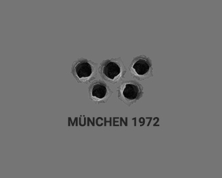
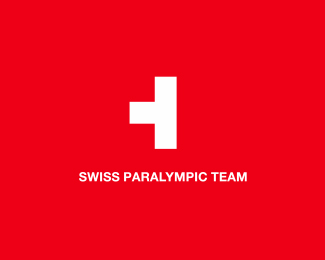
This logo represents support for Paralympic athletes. The other posters on this topic can be found here: http://logoaday.co/paralympics-posters
Status:
Unused proposal
Viewed:
1295
Tags:
jesus
•
olympic games
•
olympics
•
paralympics
Share:


Lets Discuss
Ouch. I see what you've done here but I don't know whether this is a tribute, a parody or just for fun work. Definitely not a proposition to the IOC. Very much like your Munich one, I think you're trying to rouse some feathers. Good execution tho.
Replynot sure i get whats going on there
ReplyOh David really? The Redeemer lacking the use of the other arm and the missing ring? Not necessarily trying to offend but definitely taking the piss out of the disability element.
ReplyThis idea shows a support for paralympic athletes. I don't see what else it could represent
ReplyThis is not a classic logo. Many of my works represent the tribute or try to give a message, as Munich 1972, as you said.
ReplyTurn left?
ReplyNo. What you saw was an opportunity to exploit. I personally don't see it as a tribute much less a gesture of support. The same goes for your Munich and Paris ones. Although technically very well executed, I find them to be pretentiously tasteless.
ReplyIt's your point of view, and I told you it's wrong :)
Replygraforidza strikes again :) guys, don't look at his logos as something to compare with here on pond :) certainly not commercial efforts, just a statements in graphic form... I like it, as there are not so many designers bothering to do that here lately... on the other hand (no pun intended here) you may like it or not, or you may see something completely different (happen to me lot of times with his work). Someone mentioned on forums that we need to steer some things in graphic design world... heck why not
ReplyAlso, it might be a culture/region difference in perception, as I see folks from different regions react differently to graphic provocations or sorts like this... @graforidza 's problem might be that his work is not working on global level in delivering the message he intended, but I like the effort again... at least it is not yet another made up fake company easy two word logo :)
Replythis is dumb.
Replyyou know what the rings means?
I think the genesis of Olympics and more for Paralympics, is to create hope, a fighting spirit that in spite of an athlete being differently able, he or she can be a world beater in field.
ReplyThis logo, in my opinion, mocks that basic concept of hope. I am sue the designer did not have any such intentions, but its looks repulsive to me. Sorry!
Nicely executed but I have to agree with Nitish, a Paralympics logo should capture the drive, competition and achievements of the athletes-not focus on their disabilities.
Reply@chanpion i must have been looking at this with tired eyes didnt even get the rio statue missing an arm. The message is questionabble yet provocative, got you all riled up didnt it. And in the end isnt that what we strive for? An emoti9nal and memorible reaction to our work. The premiss may be arguable even a bit distateful, but it works as a logo...
Reply^ Same could be said for the swastika.
ReplyExactly sam
Reply@David, I essentially understand and appreciate what you said and I absolutely agree with your point regarding provocative designs that can arouse emotions. But like I said I personally feel the designer of this logo created this and other similar works purely 'for fun'. It was definitely not trying to be provocative with the intentions of SUPPORT or TRIBUTE. And nothing wrong with JFF logos, I just find this to be conveniently exploitative and inappropriate. It's certainly not a goal in design that I strive for.
ReplyThe thing is, I love alot of his work in the showcase. I just don't find his 'provocative series' that enticing and I personally feel it's tarnishing the rest of his good works.
Yeah I get what you're saying, it's one thing it if he's trying to make a point it's another if he's just trying to 'take the piss'.
ReplyPlease login/signup to make a comment, registration is easy