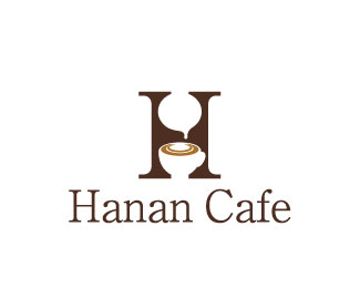
Description:
coffee shop.
H&C
Status:
Unused proposal
Viewed:
1556
Tags:
cafe
Share:

Lets Discuss
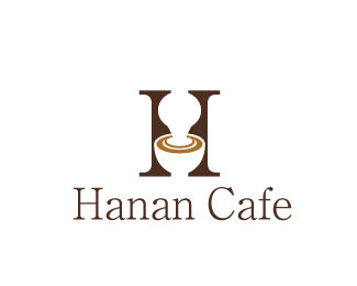
Aha! This is good but not as strong as your previous version. I have an idea, with this version join the milk/froth drip to the froth of the cup and make it thicker and off centre so that the concentric circle patterns is off to one side as well. Does that make sense? After you've done that, maybe take the cup ear away to see if it works. Less is better.**Next is choosing a better serif typeface. Something a little bolder than what you have but not as bold as the mark so its not fighting with each other. Cheers.
ReplyThank you, I appreciate your advice. *I am truly sorry that it took me a long time to reply because of my poor English.**Your idea sounds very interesting, I will give a try for it.*I could not notice about the washroom/restroom part, thank for notifying me. The logo might be better in the washroom/restroom caf%E9 in other countries.**I am making the logo while I am working, so it would take a time for me to finish the logo. However, I really appreciate your advice and I would like to get an advice in the future as well.
ReplyPlease login/signup to make a comment, registration is easy