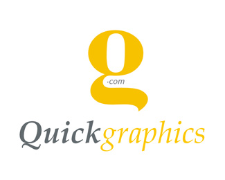
Description:
Qg typography concept
".com" nagitive space is showing hand's thumb, that means graphics (images) in your hand for quick access
g's tail downwords (for downloads hints)
Status:
Nothing set
Viewed:
1406
Share:

Lets Discuss
this one is better then the other version
ReplyHello Hani,*the tail reminds me of a Fox's tail and I think that you should work around that idea... quick..fox...! I decided to comment on this because I think it can actually become a nice logo. Use a different type for the name and drop .com. I don't think that anyone will see a thumb in there...Also try to flip the mark horizontaly just to see how it looks, perhaps that way you will get the G and the Q out of it... :)*
Replythanks for your Critique
ReplyPlease login/signup to make a comment, registration is easy