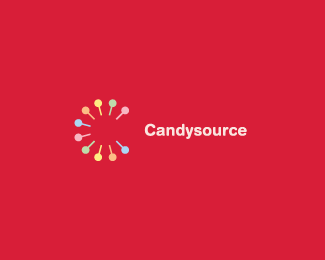
Description:
Drum/percussion based music program for young kids in schools. 'Candysource' refers to music as being 'Ear Candy'.
Status:
Client work
Viewed:
20538
Share:

Lets Discuss
Nice and clan. Excellent logo Hayes!
Replynice. very dache-esque.
ReplyAnother nice one. Well done. Is that Helvetica Rounded?
ReplyMan I am a sucker for a good design! :)
ReplyCool...I'm away for a couple of hours %26 I get greeted with a wonderful response. Thanks guys!!**Yep Roy, it's Helvetica Rounded, I've always found it to have a 'candy-like' aspect to it :)
ReplyBrilliant. The C, the drum shape, the pops. One of your best designs yet, Hayes!! Great color scheme too.**@ KGB : Dache-esque? I don't think he can take full credit for this style. Just my two cents. But I can see what you mean.
ReplyOh, and the mark even has an 'ear' shape to it. Dude, can't stop coming back to this.
Replyyeah Hayes... nice work dude!.. %26 I also must add that i never thought it was dach-esque!... still dont.
ReplyIt's certainly is multifaceted - now that's my bid word for the day.
Reply@fogra... %26 tomorrow ill teach you how to spell 'big' %3B)
Reply@nido: And I put so much effort into that word too - I forgot about the small ones!
ReplyLooking good! I agree with Oc, one of your sweetest designs yet!
Replyhehehe...I love logo puns :) Do you think I have this design job licked? :P**Thanks heaps guys!!
Replyi love this candylike feeling..very good!
ReplyWell Well I guess it does'nt get any better than that huh? WOW got it ALL and more in this masterpiece. Simplicity in it's greatest form.
ReplyHmmm...whats been said been said. I'll just keep my mouth shut and enjoy this wonderful piece of work.%0D*%0D*Dache-esque? Give me a break.
ReplyYou're all a bunch of suckers.
ReplyThanks guys :)**@smartinup%3B Yep I wanted to incorporate both the 'candy' %26 'drum' elements into one...the percussion mallets felt like the best fit as they look so much like lollipops (their colour scheme was inspired by a pack of fruit mentos) %26 it fit together nicely as a 'C'.**Cheers!!
ReplyWow! I could lick at this for ages.
ReplyIn my opinion, as general feel, is much too close to the Imagistica logo: www.imagistica.com
ReplyThis is shweeet!! Took me right back to my childhood and xylophones!!*Absolute genius, Hayes!
ReplyThanks guys!! **@Respiro%3B I appreciate the concern, but I think there are more differences than similarities :)**@Naekie%3B Yeah, I remember learning 'Pop goes the Weasel' as a kid on one of those little rainbow xylophones :)
ReplyHayes, when I saw your logo, in that given minute I remembered the imagistica.com logo...
ReplyFair enough...
ReplyThis log has now been approved by my client...**Thanks again everybody for your comments :)
Replygood
Replyrealy good!
Replyhttp://www.artgraphics.ru/identity/best2006.html %0D*hear is similar logo
ReplyThanks!!
ReplyCongrats, dude. Even better when the client gives the go ahead.
ReplyCheers Kev :) Always a plus when the client likes it, working on the print collateral currently, might showcase some of it on Flickr :)
ReplyHayes, you are a champion! This is such a cool logo and the colours are excellent. I almost want to lick it :P
Replynice work!
ReplyCheers guys
Replyi am a kid , watching your musical design....nice mark
ReplyThanks designnectar!! :)
Replylove it, simple but effect
ReplyThanks Huyen :)
ReplyOne of the best here on logopond!
Reply%5E I concur. One of my favs.
ReplyLooks like I missed your comment in the mix Milos...glad you guys like it :) One of favorite projects, as well as the strangest bunch of guys (the Candysource crew) I've worked with.
Replyclicks rights away!
ReplyThanks!! Glad it got through :)
ReplyAlways liked this one, JH.
ReplyThanks Joe :) It's one of my personal favorites too.
Replylol Thanks Alen :)
ReplyPlease login/signup to make a comment, registration is easy