Description:
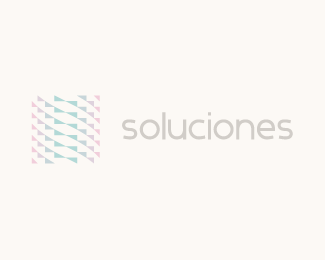
Madrid based soluciones is a company offering computer consultancy for medium and small enterprises. The solution for their new identity uses multiple facets to show the networking element of the business. It also incorporates the “S” of the company name.
As seen on:
http://www.helveticbrands.ch
Status:
Client work
Viewed:
2619
Share:



Lets Discuss
Really liking this
ReplyIs this the illusion or triangles are curved?*Looks nice and interesting.
ReplyThanks guys.*The triangles are not curved %3B%5E)
ReplySo you created curviness as illusion! Very neat David.
ReplyIntriguing stuff :)
Replythis is cool man!
ReplyI appreciate the comments. Thanks!
ReplyDamn, this is an eye catching design...in a good way:)
Replyamazing. loving the trick it plays on the eyes.
ReplyEven tho i really love it, it reminds me every time on Gareth%60s Synchology http://logopond.com/gallery/detail/104436. It seem that there has been some sort of the inspiration involved.
Reply%5E hmmm, I don't see the relevance
Reply%5EExcept from the, probably, grid based triangles used to form two opposite shapes to communicate %60sync%60? Both designs are using very unique and different approaches. I%60ve seen Gareth%60s first, so this one really do remind me on it every time.
Replyapproach*
ReplyThanks for the comments.*
ReplyThis is fantastic! Love it!
ReplyPerfect!!!
ReplyCool, mate! :)
ReplyThanks everyone for the floats. This project is now complete. *
ReplyPlease login/signup to make a comment, registration is easy