Description:
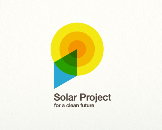
This was created for a Swiss-based solar panel manufacturer.
As seen on:
http://www.dache.ch/
Status:
Nothing set
Viewed:
2631
Share:



Lets Discuss
Nice one Dache! The concept is really good. The mark might be a bit big compared to the type, but it stands out well %26 caught my eye immediately. I like the green 'eco' segment in the sun.
ReplyThanks Andrew, Im glad you picked up on the reference to clean green 'eco' energy. The symbol size here is a bit more for presentation so that, as you say, it catches the eye. Im quite pleased with how this logo turned out.
ReplyYou should be very pleased! The colours work both conceptually %26 scientifically. Bravo!
ReplyThis is one of my favorites! I get a Picasso-esque feel from the two dimensional representation of elements. Nice work!
ReplyThanks guys :%5E)
ReplyFloating bug.
ReplyPlease login/signup to make a comment, registration is easy