Description:
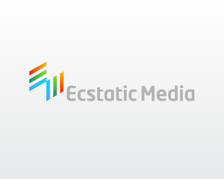
This unique union of the letters 'E' and 'M' was created for a company offering web design, programming and marketing services. This is the retained concept by the client.
As seen on:
http://www.dache.ch/
Status:
Nothing set
Viewed:
6459
Share:
Lets Discuss
Interesting type treatment.
ReplyI like your other mark better. Even though this one is more simple.
ReplyOcularInk: Thanks, its NeoTech - I quite like it. It will probably not remain in the ultimate design.**KGB: Yes I feel the same, but the client is very happy with this design %3B%5E)
ReplyExcellent work. I particularly like the global feeling of your creation, even if, as KGB, my designer's heart prefers your first proposal.
ReplyI didn't see the E and M right off ... but now I think: brilliant!**I especially like the business card on your site.
Reply!http://dache.ch/images/ecstaticmediabusinesscard.png!:www.dache.ch**Thanks very much for the gallery add and kind comments. For those interested in the business cards as mentionned by rfrusso they can be seen above.
ReplyExcellent business cards dache!! Logical and beautiful.
ReplyMerci Andrew :%5E)
ReplySelected for the new LogoLounge %22Shapes and Symbols%22 book.
ReplyPlease login/signup to make a comment, registration is easy