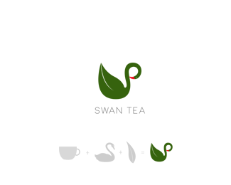
Description:
Swan tea
Status:
Just for fun
Viewed:
985
Tags:
black
•
green
•
leaf
•
cup
Share:


Lets Discuss
I think this is a great logo. I really like how you combined both the "S" with the swans body and then created a tea leaf for the rest of the body. Looks great! I could see this used professionally on the side of tea cups and on the front window of a tea shop. Great job.
ReplyI'm going to have to disagree a bit. I think there's one too many symbols trying to exist in the same mark. It doesn't really look like a tea cup to me, so without that it's just a swan in an awkward position. Why not just have the swan in a natural, posed position (looking forward) with the leaf for the body? The leaf already brings the tea element to the logo, I don't think you need another tea element.
Replyerodley, Thank you so much for your comment. Glad you liked it.
Replysamdemastrie, you're right the logo has too many elements and I could use either the tea cup or the tea leaf to represent the tea element. I'll put that point in mind. I thought about using only the swan's body and the tea leaf, but this concept is already done and I didn't want to use the same concept even I could play with it and make it looks totally different. So, I decided to have the three symbols and combined them in the logo. Thank you for your comment and I will definitely keep that in mind when working on logos.
ReplyPlease login/signup to make a comment, registration is easy