Float
(Floaters:
1 )
Description:
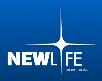
Logo design for Mid-West production company
Status:
Nothing set
Viewed:
1316
Share:




Lets Discuss
comments. suggestions.
ReplyUnfortunately, it reads as %22NEWL%22 %22FE%22, which is obviously not what you had intended. You may want to consider using a slightly lighter (thinner) weight for the word %22LIFE%22 and then make your star significantly larger and/or longer so that the thicker part of it matches the weight of the type more closely.
ReplyOne thing to add to sdijock is to put the original %22I%22 back in just to adjust the kerning then remove it. There is too much space around the down point of the star which removes it even more from representing the %22I%22 in LIFE. And, just a thought, I would move PRODUCTIONS over so that the tip of the down point takes the place of the %22I%22 in PRODUCTIONS as well. Should help reinforce what the star represents.
Replythanks for all the feed back. I'll post a revised version*
ReplyPlease login/signup to make a comment, registration is easy