Description:
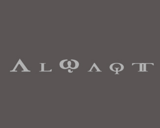
A logo designed for a friend who sells timepieces. AlWaqt means Time in Arabic.The font type is Achillies (I think!) with a few changes. Critiques are most welcome since I am new to design and want to improve my work.
Status:
Nothing set
Viewed:
1038
Share:



Lets Discuss
The W with a tail (lowercase omega) looks out of place, might as well use a regular W, with serifs
ReplyI think the purpose with the W is to separate the word 'cause the first A has the same appearance.
ReplyPlease login/signup to make a comment, registration is easy