Description:
This is a current job for a client.
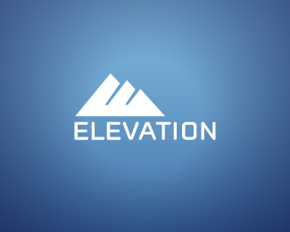
I'm looking for ideas on how to make the "E" in the mountains stand out a little more.
Status:
Client work
Viewed:
962
Share:


Lets Discuss
Similar logos have been done here with F, M, IM, etc. Just a heads up.
ReplyNot to mention Logomotive's: http://logopond.com/gallery/detail/70912
Reply%5E and this one's even closer. http://logopond.com/gallery/detail/71102
Reply%5EAs close as they get.
Replywow...*the funny thing is, this came straight from my thumbnail sketches**I'll have to make some adjustments. Sorry for the similarities Logomotive.**
ReplyPlease login/signup to make a comment, registration is easy