Description:
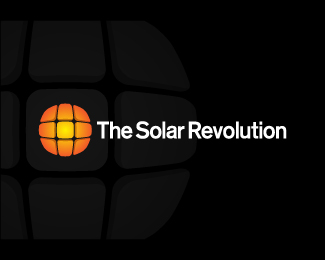
Updated concept. Revised the type and also slanted the boxes giving the logo more energy. An additional bonus to slanting the boxes is the illusion of solar panels setting on a roof.
Status:
Nothing set
Viewed:
1286
Share:
Lets Discuss
I have to admit I did not like this at first but the angles of the boxes sucked me in... I dig it man!
ReplyThanks for the feedback and honesty. What made you not like it at first? Just curious to get more critique.
ReplyFriend it's such an honor that you asked me! I think it was over simplified to the point that I didn't see that they were raised panels like you would see on a roof. Secondly the color looks like highlighter color. Once I figured it was text on the solar panels themselves, that's when I liked it. It's that ad guy in me that wants follow the advertising steps of... 1- Stop them 2- Let them interact with it 3- Give them something to take away.**So what does that mean? 1- Stop them with a clever idea (panels in the sun/creative illustration 2- Interaction (Oh I see the panels now) 3- Take away - (Interesting use of text alignment with panel illustration, seems original)**Lastly - It says solar but does not speak to me revolution. So that might be helpful to see that in there... I know I'm not great at this either so I'll point to someone who NAILED IT... http://logopond.com/gallery/detail/91660 This illustrates my point perfectly.**Thanks again friend!
ReplyThanks for the critique! That's the kind of feedback that really helps me. Too many times people say they like something but don't ever explain why. It's the %22why%22 that really matters.**I'm currently finding it a bit hard to narrow down the concepts to present but feedback like this will make my decision easier.**Thanks again for the critique.
ReplyPlease login/signup to make a comment, registration is easy