Float
(Floaters:
7 )
Description:
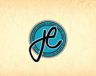
Working on a new personal identity. What are your thoughts?
Status:
Work in progress
Viewed:
2585
Share:




Lets Discuss
i'm not sure the monogram and the seal behind it (which i really like) match in style. it is an interesting concept though. how does it look with the signature within the seal?
Replyyep, lecart is right. you may try to integrate the monogram into the seal:p
ReplyI appreciate the comments guys. Yeah I have tried that, but I seem to be having problems with unwanted negative space and alignment issues. I wanted a free, flowing, organic looking monogram which could almost be laid atop the seal as an integrated (but dominant) component..... back to the drawing board for a tweak session I think.
ReplyI personally prefer the type only %22logo%22 you currently have on your website... its cleaner and its... you!... and if you're worried that's its only use of an existing font.. well then.. tweak it a little.. not much more needed... imo...
ReplyPlease login/signup to make a comment, registration is easy