Description:
This logo for a theatrical production has been featured in the books New Logo & Trademark Design (Japan), The New Big Book of Logos, Letterhead and Logo Design 7 Graphically Speaking LogoLounge - Volume 1, New Logo: One (Singapore) and ColorWorks (UK-2008).
As seen on:
bLog-oMotives
Status:
Nothing set
Viewed:
8313
Share:



Lets Discuss
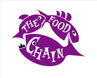
the idea is great, but I was wondering about two things. Why does the biggest fish has a pair of dark teeth and the upper are white (and the others don't)? and why don't you switch the smallest with the intermediate, like an ideal food chain (the big fish eats the small one)?**anyway Great job!!!
Reply@mihaelutzu, the two smaller fish have white teeth that are made from the negative space between their mouth and the fish in front of it's tail. I guess it just did not work out as well doing the same technique with the bigger fish. But I do agree with your comment on the smaller and middle size fish needing to be switched to better convey the true idea of a food chain. Nice nonetheless though.
ReplyThe smaller fish eating the increasingly bigger ones is a visual interpretation of the irony within the context of the play that the logo represents. It is not always necessary for design to be as literal as the viewer may want it be.
Reply@Jeff,**%22...is a visual interpretation of the irony within the context of the play...%22**gotcha, makes more sense now.**%22It is not always necessary for design to be as literal as the viewer may want it be.%22**yeah, I agree.
ReplyI for some reason read this as %22The Chain Food%22. Just something to think about. Love the illustration though.
ReplyPlease login/signup to make a comment, registration is easy