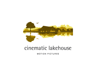
Float
(Floaters:
59 )
Description:
Alternative execution for motion graphic company.
Status:
Client work
Viewed:
5745
Share:



Lets Discuss
http://logopond.com/gallery/detail/102542 *tough competition..
Replythe reflection of the tree is too perfect, in comparison to the other elements reflection, maybe even loose that tree, and emphasize the house more
ReplyThey're nothing alike, those two logos sbj.**Nice work, buddy :)
Replyi agree with eziemac. and dotflow has a very good point. don't actually lose the tree reflection, but rework it and lose detail. also on the bird. my 2 cents.
ReplyThank you all for the comment. Appreciate it
Reply@ezimac- i was talking about competition betwen the execution n style :) not rip dear..
Replystyle and execution are great!*congrats, Jippy!
ReplyThank you Claude!
Reply@ dotflo %26 lecart: thank you for your inputs. I will have it revised. Appreciate it :)
ReplyJust beautiful.
ReplyThank you Mabu.. :)
ReplyWonderful logo
ReplyThank you ferret ..
Replyfine details...beautiful
ReplyWow, beautiful illu.
ReplyWonderfull logo!
ReplyThank you guys..
Replygood job!
ReplyPeacefull!
ReplyPlease login/signup to make a comment, registration is easy