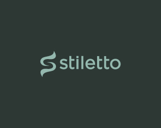
Description:
WIP for a mobile platforms company. The mark is influenced by the double meaning of Stiletto; a sharp dagger or knife and a woman’s high heel.
Status:
Unused proposal
Viewed:
5354
Share:



Lets Discuss
Very nice!
Replythat is a beautiful logo. type and mark are both great, but maybe largen the mark and move it slightly to the left?
Reply@Art Machine, thank you Julian.*@alexanderspliid, I appreciate the kind words. I will update with those changes, thanks.
Reply*Updated, thanks Alex.
ReplyVery nice indeed, but I am not getting %22mobile platforms company%22 from the logo. Unless it's %22these platforms%22:http://www.google.ca/images?q%3Dplatform shoes :)
ReplyDamn... %22Correct link%22:http://www.google.ca/images?q%3Dplatform%252Bshoes %3C- click
ReplyAlex, the client is looking for a logo that is modern, memorable, and unique. The solution I provided was heavily inspired by each aspect of the word Stiletto. Thank you for your comment.
ReplyI understand that you played off the angles of Stiletto as a word. I'm just saying that it seems disconnected from the actual nature of their business. But if they like it and think it works for their purpose, who am I to object?
ReplyNo problem at all Alex, I appreciate you taking the time to comment. Still waiting to here back from the client on this one...cheers :)
Replythis is really great! I like it.
ReplyThank you James! :)
Replygood job man!
ReplyThanks for the comment, Matt!
Replyvery cool s.
ReplyThanks Paul :)
ReplyUnfortunately this one is going into the unused bin though.
ReplyPlease login/signup to make a comment, registration is easy