Description:
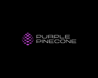
WIP. For a fashion design company called Purple Pinecone. I know the mark is very trite considering the company name, but this is the direction the client wanted to move in.
As seen on:
Admix Designs
Status:
Client work
Viewed:
9958
Share:

Lets Discuss
looks nice man
ReplyLoving this one Joe!
Replyyeah, i agree, with a nice type this will end up solid.
ReplyJoey is back on track, eh?
ReplyIvan, Roko, Stelian, Milosz...thank you all! Working on pairing it with type, thinking something thin. Cheers!
ReplyI wouldn't say the mark is trite, especially because the name is so 'specific', it's really quite apt.
ReplyI don't think it trite either. It's a fresh artistic execution of a literal object. Design at its essence.
Reply%5E agree with prev. comments. no trite.*only one thing maby: the paricle on the top seems somehow unbalanced, probably oversized a little bit.*or that's just me?
Replymark is perfect..
ReplyNice, Joe!
ReplyI really appreciate the feedback from everyone. It's still a WIP so I'm working on fine-tuning the mark.*@hyperborea, you're right. I'm working on that top piece :)**Updating with type soon.
ReplyUpdated with type. Cheers!
ReplyNICE!*
ReplyThanks Roko. Wondering if there's a better option for the type layout...was thinking splitting the type with horizontal and putting the mark between.
ReplyHmm, you can try with that but I think this layout will work best. Also, did you try with gray color for the type? *Black seems a bit %22strong%22...
Reply%5EUpdated, thanks :)
ReplyPerfect! Faved:)
Replyturned out great
ReplyNice solution Joe, clean.
ReplyEvery day is better than yesterday! %3B)
ReplyCheers everyone! :)
ReplyReally nice Joe!!
ReplyI'm glad my comment was useful.*ended up very nice...
ReplyGracias amigos, really appreciate the feedback.
Replyperfection..
Replythis is looking great, Joe. really coming together. love it.
ReplyBravo JP!
ReplyDig it a lot JP!
ReplyI agree with Hayes - it's not trite. It's so peculiar with it's name and your interpretation of a pine cone.**However, your composition makes this much akin to a high-tech/software logo simply because that is what those type of companies have been doing for the last 10 years. 'particle' based logo to the left of 'sci-fi' font.**In design, and especially fashion, when you have something very good, you accentuate it. In this case, it's the stylized pine cone**
ReplyMe likes it Joe nicely done!
ReplyYou all are too kind, thank you very much!*@Raja, I agree with your statement. I had a different rendition with the mark in between the type...might switch back to that and see. Cheers!
ReplyNice logo Joe. Some comments on type though. Some letters remain unbalanced comparing to others, too extended I think. /U and /R are slightly too large when you look at for instance /P (for /R) and /O (for /U) and /N looks too much condensed (comparing with /E). I think fixing these (peeky :)) details could slighlty improved the overall design.
ReplyThanks a lot for your suggestions, Thomas. I always appreciate hearing feedback from you. I'll take a look at those characters and make some updates. Cheers!
ReplyNice, Joe! I don't think it's trite at all, you have done the pine cone in a unique fashion.
Reply%5EThanks a lot Sean! Hope we can see more of your work soon...
ReplyI agree it's uniqe, great job on this one :)
ReplyWow JP.
Reply@Alex, Breno...thanks a lot fellas.
ReplyClient loves it, accepted :)*Thanks for all the feedback and comments everyone.
Replycongrats! %3B)
ReplyThanks a lot Riz!
ReplyYup, congrats Joe. *I'm still loving it:)
ReplyThanks a lot Roko!
ReplyLovely logo.
ReplyPlease login/signup to make a comment, registration is easy