Description:
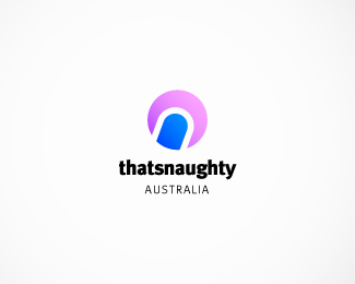
This was a concept for an online adult store called "thatsnaughty". The "n" was the primary focus with the obvious naughtyness implied via colouring.
Overall I was quite happy with the outcome but the client thought it was a little risque.
One problem I could see cropping up if it were used is losing meaning when used in mono or greyscale.
As seen on:
Thatsnaughty Australia
Status:
Unused proposal
Viewed:
615
Tags:
blue
•
pink
Share:


Lets Discuss
Please login/signup to make a comment, registration is easy