Description:
...
Status:
Just for fun
Viewed:
9454
Tags:
typography
•
gandhi
Share:


Lets Discuss
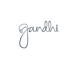
I like it - just think that the line thickness on the gandhi face or 'g' is a little thinner than the rest and could be made to match.
ReplyAwesome work its brush work..?
ReplyAppreciate the feedback Herbert & raffim no... Not brush work... Sketched it in paper scanned and vectorized in illustration...
ReplyHello Johnm! I'm a student from "Mahatma Gandhi Institute Secondary School" and recently I've been looking for some logo ideas to update our former one. Can I borrow some ideas from your logo please? :) i love all your amazing logos!
ReplyPlease login/signup to make a comment, registration is easy