
Float
(Floaters:
32 )
Description:
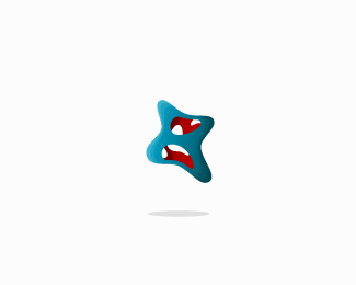
wip, one of many ideas for a newborn design company.
Status:
Client work
Viewed:
4184
Share:



Lets Discuss
nice placement for the initial.
ReplyGood job. Maybe smaller mark, bigger type.*And try with some different background. That gradient is poking my eyes:)
ReplyI love the idea, jeje, clever placement for the %22C%22 agree with Rokac,
ReplyLove the hidden %22C%22. Really nice concept.
Replysuper
Reply%5E%5E%5E%5E
ReplyPlease login/signup to make a comment, registration is easy