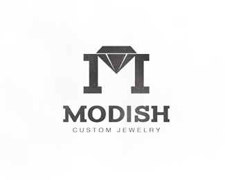
Description:
Logo for a custom jewelry store.
Status:
Work in progress
Viewed:
6798
Tags:
diamond
•
jewelry
•
m
•
logo
Share:
Lets Discuss
Clever idea!
Replyyeah, this is cool - the texture is interesting, but reminds me of stone - as opposed to jewels - or is it a diamond in the rough!? : ) Also, perhaps the %22m%22 in modish and the %22m%22 in the mark could be closer in appearance to create some more cohesion. I really like the overall concept. It's contemporary and subverts the traditional jewelry store logo! nice work.
ReplyThanks for the comments guys! Modish means contemporary, trendy, and in style now so I wanted to make this logo stand out a bit from the more traditional jewelry logo style. Also dan, I love your diamond in the rough interpretation on the texture!
Replycool... i think you're definitely on the right track with this one!
ReplyPlease login/signup to make a comment, registration is easy