Description:
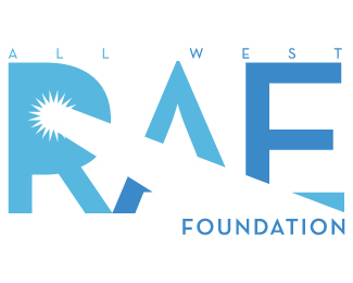
This is a rebranding of the original logo from 2003 that I had designed. The client wanted to refresh their company image along with their new website and marketing. They wanted to stay true to the original "sunburst", however focusing more on the company growth throughout the country. The main icon displays the navigation pointer pointing west, with arrows north and south, with the east arrow being white space in the wording.
As seen on:
All West Lacrosse
Status:
Client work
Viewed:
2194
Tags:
sun
•
gps
•
navigation
•
lax
Share:


Lets Discuss
kinda seems like the ball should be moving to the West.
ReplyPlease login/signup to make a comment, registration is easy