Float
(Floaters:
1 )
Description:
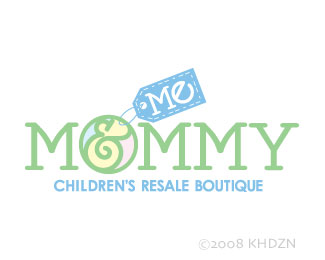
Logo for children's resale clothing store
Status:
Nothing set
Viewed:
1519
Share:


Lets Discuss
whoops?
ReplyI still don't understand the comment???%0D*%0D*I intentionally designed the logo, yes. Did I spell something wrong?
ReplyThe logo clashmore is linking to is a rather famous (at least in graphic design circles) logo done by Herb Lubalin.**Your logo, perhaps unintentionaly, appears to be a derivative of that.**It's not that your logo uses the same concept, as I think they can live in the same universe together, but the challenge is that Lubalin's logo is considered an iconic classic, so a lot of folks are going to make the connection to yours.**The 'fix' is just to call your logo an homage to his. %3B0)
ReplyI didn't realize the first whoops was a link. I had no clue what you were talking about. Guess I need more coffee.%0D*%0D*I don't recall ever seeing that logo before. Thanks for the heads up!
ReplyYep, the link logo was created (by Herb Lubalin as darrel said) back in 1965. It is rather famous and most students are introduced to it in design school. Lubalin was a typographic pioneer of sorts. Oddly enough though, the Mother%26Child logo was for a magazine that was never published.
ReplyThen I probably saw it about 15 years ago when I was in design school. I did not have that logo in mind when I set out to design this one though. I almost put both the %22%26 Me%22 in the O --good thing I didn't! I appreciate your feedback!
ReplyThat mother %26 chid logo is fantastic in every single way with the amphisand taking on a noticeably foetal shape. I’d not seen it before. %0D*%0D*mommy....haha. That word cracks me up when I read it out loud. (Aussies spell it mummy)
ReplyPlease login/signup to make a comment, registration is easy