
Description:
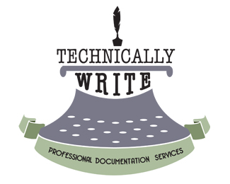
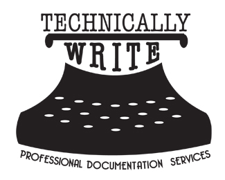
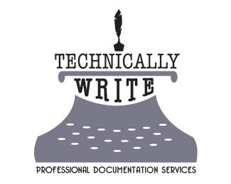
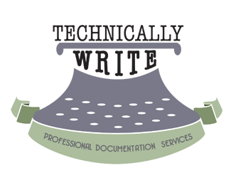
A logo for a customer for a technical writing business
Status:
Work in progress
Viewed:
1110
Tags:
typewriter
•
pen
•
technical
•
writing
Share:




Lets Discuss
My first thought is why you decided to go with an antiquated looking logo for a technical writer? Technical writing and antique typewriters are pretty much diametrically opposed to one another. So the general concept doesn't make sense to me at all. Did you actually speak to the client about what they were looking for before embarking on this logo?
ReplyAs for the logo itself, it's just ok. Nothing really stands out to me.
Technically wrong, sorry.
Reply^lol.
ReplyBest advice you will get here on this.
Thanks for the comments, guys but any advice/ideas would be great instead of just negative feedback! It's still a work on progress, I just didn't want to go with a computer or something like that .. was looking for a more retro look.
ReplySteve (sdijock) took time to give you constructive feedback.
ReplyHere are some examples of typewriter logos. Can you see where you are going wrong?
http://bit.ly/1f6hylG
http://logopond.com/search/?search=typewriter
Replyhttp://dribbble.com/search?q=typewriter logo
ReplyRESEARCH!
I do understand that that was constructive and really appreciate it. The client really didn't know what they wanted for the logo at all and I definitely didn't do very much research to begin with, just started throwing ideas around on paper.
ReplyI can see where I'm going wrong, thank you for the links. I'll be posting more soon and look forward to the comments!
@ KaylaJoy - Conceptually your logo doesn't make sense – not only to me but other designers as well. I had asked why you went with an antique typewriter and whether or not you had spoken to the client about their needs/ideas. How is that being negative?
ReplyPlease login/signup to make a comment, registration is easy