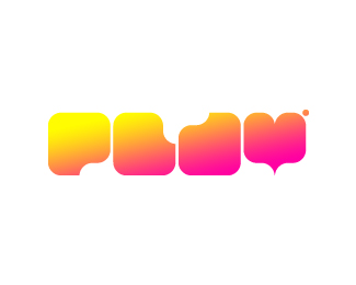
Description:
Logo for motion design agency.
As seen on:
http://kliment.bg/
Status:
Nothing set
Viewed:
3594
Tags:
game
•
fresh
•
motion
•
logo
Share:


Lets Discuss
Nice idea, but the 'y' looks a bit odd. I would pull the bottom of it down so that the descender...er - descends below the baseline. Apart from that I like it!
ReplyYeah drewboy you may be right!! *I'll try it, thanks :)
ReplyAlso, that doesn't look like an 'a' to me...
ReplyYEEEEAHHH!!!
Replybpotstra too bad %3B)*simov HEEEL YEAAAHH!!!!
Replynice one! I agree with drewboy about the %22y%22
ReplyThanks ...
ReplyThe L's boolean could drop a bit lower too so it looks more like an L. Totally on board with drewboy's comment.*Does it really need a gradient? My eye gravitates too much to the a %26 y
Replylovely
ReplyBeautiful logo, the type looks great!
Replyyou know it says %22soming soon%22 right?... :)
ReplyStill extremely popular at Behance... Gratz!
Replyheheh %3B)) thnx!
ReplyPlease login/signup to make a comment, registration is easy