Description:
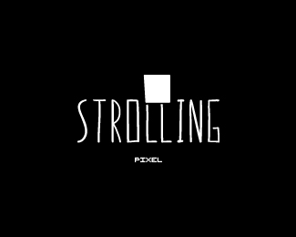
Practice. Had the idea walking around in my mind.
*update: dusted this off. hopefully more successful than version 1.0
Status:
Just for fun
Viewed:
1929
Tags:
black
Share:


Lets Discuss
Really Cool idea, Perhaps the L's need to be longer to match the last L. I am not reading Strolling at the moment.
ReplyVery clever. Cerise has a point, but if I'm right, you made it that way so that the Pixel has the same height as the other letters.
Replyyou can keep the pixel the same height, but add length to the legs/Ls. they just don't show all of the L height and therefore look too short.
Replythe concept is really good, it does lack some final touch to make it outstanding. definately looking forward to see the update on this one
ReplyHey thanks for all the suggestions! @Climax I'll definitely give that a try. Originally I had the L's straight, making the strolling pixel seem rather stationery.
ReplyPlease login/signup to make a comment, registration is easy