Description:
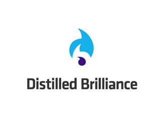
This is for software solutions company in Virginia. The mark is versatile in that it forms the interlocking shapes of a "d" and "b" using water droplets (play on the 'distilled' word). However, the droplets are actually stylized quotation characters, which are a reference to programming syntax. Overall, a clean 'refreshing' look.
Status:
Nothing set
Viewed:
1904
Share:




Lets Discuss
nice use of positive and negative forms*
ReplyVery nice. I like the triple meaning.**Beautiful font, too.
ReplyI like your concept but the water drops do not look like drops and the inside of the %22b%22 is distracting by way of color/contrast and angle of tails, seems the drops are not flowing right if that makes sense.
Replyi thought 'British Gas' first...
ReplyThat's a big stretch.
ReplyExcellent work even if flamed(so sorry to agree with Nido's rude comment)-rounded mark and/or colour scheme don't convinced me...
ReplyWhat don't it convinced you of?
ReplyBecause (so sorry...) I thought, at first sight, as Nido, it was for a gas company or some business like this... It looks great, it is great, with a very clean and professional feeling. The mark is excellent and fits perfectly well with font treatment you realized on klavika. I've simply reacted and commented it as it was for my own software business and I said something doesn't convince me (which, I know, is quite far from a constructive criticism). I think your logo is great but I just can't imagine it for a software solution company, just personnal preference. I particularly like your design work and especially on this one so I hope you would not take my comments in a bad way, just because of my %22not-enough%22 aware mind and too conservative (isn't it ridiculous?) vision for that kind of business...
Replywhy do you keep apologizing Thomas?.. and its no big stretch mate.. my first impression was 'British Gas' or as Thomas mentioned a 'Gas Company' (no apologies)
Replyi thought gas company too! :p
Replyoh %26 KultHouse.. dont go makin fun of Thomas' English like that... it ain cool.. you just look stupid.
ReplyThomas, thanks for taking the time to elaborate. Don't worry about delivering any criticisms you have%3B your original comment was just very vague and I wanted to know what you meant.**One of my other concepts was based on this design but utilized the semi-colon. The overall logo definitely yelled %22software%22, but it wasn't quite as iconic or memorable, so this was opted for. **And nido: wow, please spare me.
ReplyNo problem Josh, I knew my comment was too vague. It was just a feeling about your work. See ya!
ReplyI think this is awesome!! Some people just don't get it...do they? :-P**Nice work.
ReplyPlease login/signup to make a comment, registration is easy