Description:
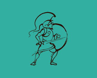
This is a logo I did when I was in college. It's still one of my favorites as I had a lot of time to work on it
Status:
Student work
Viewed:
3470
Share:

Lets Discuss
That's more of a gladiator/centurion than a paladin. A paladin would be more Crusades-y looking. His form is a little odd%3B he looks uncomfortable standing upright like that when his feet are angled as if he should be leaning inwards. But I love the style :)
ReplyI appreciate the criticism from biscuitrat, but honestly, I think this is a pretty sick design! I love it, the angles, the way it flows. New to this whole design process, I would love to know how you did this and what program(s) you used.
Reply@biscuitrat**Thanks for your crit.*I understand your association of Crusades and knights but I feel that Paladin has a more %22king's champion%22 association to it. Also I wanted to get away from the cliche of a Crusader or a Trojan. Why can't Paladins exist in Ancient Greece :P? I agree that his pose is a little awkward, I will try to fix this when I get a chance.**@Thidan*Thanks for your kudos :) I did this using traditional pen and India ink and drew a bunch of designs with a stick/reed pen (although I think it was just a stick) on tracing paper. Not all designs were so great so I blended their elements until I got the one that I liked. After that it was scanning, tracing, and tweaking in Illustrator.***
ReplyWow. Very dynamic.
ReplySlick illustration.
Reply:) Thank you.
Replyawesome lines, there is a real sense of movement here. love it!
ReplyGreat illustration!
ReplyPlease login/signup to make a comment, registration is easy