Description:
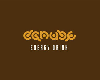
The name is derived from the Danube River in Hungary. The typography is 100% custom made and the orange color refers to the energy, the brown of the caffeine.
A central starting point drove consistently throughout the whole typeface. The letters stems from small waves reached up and surrounded by the inscription round, giving turbulent atmosphere.
Graphic Design Categories Winner of "The promise of yeras of creative"
Visual Arts Project and Exhibition.
2010 Hungary, BKF (Budapest College of Communication and Business)
As seen on:
www.behance.net
Status:
Student work
Viewed:
7987
Share:

Lets Discuss
great lettering
Replyvery unique approach. nice.
ReplyCool work! I thought it was an ambigram at first - almost is. Thanks for the explanation, it really makes the design that much more interesting.
ReplyThanks guys!
ReplyHard to read and typo style looks a little dated IMO
ReplyIt looks cool but I wonder if it would work. As jonnyd pointed out it's not very legible and indeed it might look a little dated. Also if I'd stand in front of the energy drink shelf I think this wouldn't really stand out to me, then again, that would depend on how you'd implement it into a bottle/can.
ReplyLegibility is subjective. :)**The typeface can view the entire portfolio:*www.typographyserved.com/gallery/Duna-typeface/649843**Packaging:*http://www.thedieline.com/blog/2010/9/15/danube.html*http://www.packagingoftheworld.com/2010/09/danube-student-work.html***Thanks for the comments!
Replynon-standart, interesting
Replyit is unique, but i cant read it.
ReplyThx and sorry!!!*:D
Reply%5E it's a marmite kind of logo really. I don't hate it, true that is yr point about something which is not forgettable as well. With a little more maturing it could tick all the boxes! However as it stands it belongs more in a FUSE collection as an experimental typeface that on a retail shelf!
ReplyI agree with David. This type of logo is not necessarily and at all costs be readable at the moment. In my opinion this is one very memorable logo. I don't like color schemes at all. Some lime light green-black color scheme would be good solution.
Replycool!!
ReplyPlease login/signup to make a comment, registration is easy