Description:
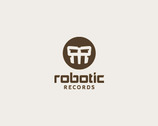
Record label. Client wanted a techno-robotic look, slightly aggressive.
As seen on:
my portfolio
Status:
Client work
Viewed:
8592
Share:

Lets Discuss
i like it.
Replynice %3B)
Replygood looking logo
Replythanks :) waiting for client's final approval.
ReplyI see a sort of %22mortal-kombat-ish%22 mask instead of a robot. The double R is cool anyway!
ReplyCool piece!
ReplyIt reminds me of the aliens from District 9. Very nice!
Replycongratz on the gallery :D
ReplyWhen I look at it, it makes me think of Darth Vader, maybe because I'm Milo the Padawan. Good job Lecart!
ReplyThanks guys, and David for the gallery spot! This got approved. Client was very receptive, a great collaborative experience!
ReplyCool! Reminded me of District 9 as well (great movie by the way).
Reply%5E agree, nice work! :)
ReplyLooks good.
ReplyI agree with William about the Mortal Kombat! But the logo is great and you can feel the robo-power.
ReplyLooks kewl. Reminds me of MF Doom's (hip-hop artist) mask.*
Reply%5E who rocks it. rhymesayers all the way. word.
ReplyI like the uniqueness to the mark.
ReplyI love the type treatment!
ReplyGood work!
Replygreat logo, love your showcase aswell, really good work in there!
Replythank you man, appreciate it.
ReplyPlease login/signup to make a comment, registration is easy