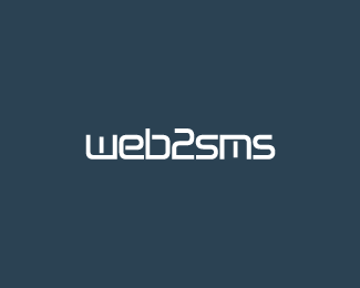
Description:
Client requested a logotype to convey a corporate yet modern marketing platform. WIP (updated twice)
Status:
Nothing set
Viewed:
1572
Share:

Lets Discuss
nice :)
Replythanks, still have to do some work on it, now that i look at it..
Replyany suggestions guys? i'm not good at logotypes, actually it's my first one. :)
ReplyFirst, a logotype should have some aspect or element to it that makes it distinct and memorable. I don't think the cuts you have in the characters are doing any justice, but think you should focus more on making everything blend together. Strive for something that makes it stand out amongst other logotypes. It does have a web-feel to it though which is nice.
Replythanks Joe! i've done some more tweaks, i think it's a step forward in regards to blending it all together. i like the cuts, don't want to lose them (though they don't look that good in this raster/smaller vs.) what do you think now?
Replyand updated once again. clients seems to like it. :)
ReplyPlease login/signup to make a comment, registration is easy