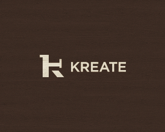
Description:
Closets, cabinetry, garages, kitchens, drawers and more. This is one of the proposals. Anyone spots anything in the mark? Thanks.
Status:
Client work
Viewed:
3768
Share:





Lets Discuss
This is the selected/approved version. This is, if you'd asked me, one of my strongest works (and it's funny how it has the fewest floats). Client wanted a K mark, simple and recognizable, and I wanted to show a (not so obvious) common element for closets, cabinetry, garages, kitchens, drawers, so i used an open drawer - profile view - for the K's arm.
Replythere's ----almost---- an R in the negative space that rings with kreate. anyway i think the logo is pretty memorable. what's wrong with you people? float this.
ReplyHaha, thanks for the support man! but there's really no need for that. i was only remarking upon the fact that, ironically, my favorite works get the fewest floats. thanks.
Replyi love it Stelian, strong mark:)
ReplyI'm glad you do, Deividas. Some pics of the logo in use (on work trucks) coming soon. :)
ReplyI think it's seen-able, but you need to look for two seconds, and you will get that perspective. Works for me Stelian, will look good on work trucks, no doubt about it.
ReplyThumbs up Stelian! As for the type, I would try with slab serif font.
ReplyThanks Roko, always with some nice input. I tend to agree on the type, bu this is already in use, as in printed stuff, and so on.
ReplyPlease login/signup to make a comment, registration is easy