Description:
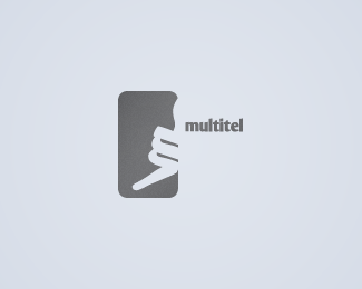
Logo for an company providing online telephony services. I tried to insert the "m" into the hand sign for calling.
Status:
Nothing set
Viewed:
2350
Share:


Lets Discuss
I don't quite know what your mark is?
Replyhey gyui, good to see you again. this is what the mark should suggest, in a abstract drawn way (as i explained in the description): http://www.istockphoto.com/file_thumbview_approve/5042691/2/istockphoto_5042691-call-me-sign.jpg
ReplyI'm not sure if the execution is working. I like how you are trying to show a hand gesture with the %22m%22, but with the gray enclosure and the hand on the right side in the enclosure, it is not apparent to me. sorry Lecart, can't offer a solution.
ReplyI like it
ReplyI like it too! Great logos hint at something familiar and make you pause to figure it out (surely preaching to the choir here). This has a nice dose of stopping power.
ReplyI LOVE THIS LOGO. though I do wonder if it would be better to make it a horizontal mirror image, so that the fingers look like 'm' for multitel.
ReplyThanks, really appreciate these comments! :)
Replyi think you should try inserting more of the hand in the frame. the concept is nice but not very clear.
Replyi see where you're getting, but i wanted it to be a bit unclear, avoiding a common illustration and the resemblance to an icon. i did some tests - 7 out of 10 people easily recognize the hand (w/o the %22multitel%22 text). However the client is very happy with it, so.. i guess i'm ok. :)**(@ tass: multumesc si ptr. celelalte voturi/comentarii - multa bafta si tie, siteul arata foarte bine!)
ReplyGnarly, dude...
ReplyPlease login/signup to make a comment, registration is easy