Description:
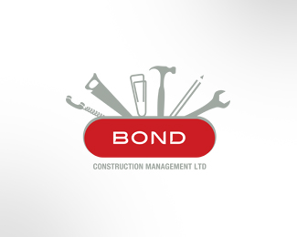
Logo for company that handles contracts and admin work for large infrastructure construction.
Status:
Nothing set
Viewed:
10045
Share:

Lets Discuss
I like this, but see two things... one, the typeface of %22BOND%22 should be slightly bigger and you may think of a new face... two, this immediately reminded me of a Swiss™ Army knife–a cool concept–but also a real brand. It's not good for one brand to remind people of another. The tools come out of a shape exactly like a swiss army knife. Maybe the color red could be changed to lessen this similarity.
Replyyeah, no doubt that's 100%25 the intention, but could lead to trouble, good point kinetic. Might be best to go for %22generic pocket knife%22 rather than swiss army red.*
Reply%22It's not good for one brand to remind people of another.%22**That statement is completely untrue Kinetic. It is not good for a brand to be exactly the same as another, but using colour or visual language to build recognition within the mind of the viewer is kind of what branding is about. Swiss army knives are red. Both brands that make them make red ones.. I don't see the problem unless you are making another swiss army knife of course.. :D
ReplyThanks for the comments people - good to know my deliberate nod to the ubiquitous Swiss Army Knife hasn't been wasted. Dale - you are right on the money, the intention was indeed to make the viewer do a double take, to see something instantly recognisable while at the same time representing something entirely different. The idea is not to exactly replicate the Swiss Army brand, but rather to convey a sense of what that brand stands for and represents%3B reliability, quality, multi-purpose, dependability and so on and so on. To use another colour other than red would ultimately defeat that purpose and result in simply a coloured enclosure with tools sticking out of it. Representing everything that people appreciate the Swiss Army for was the overt intention, and obviously it's done the trick. Creating a brand that makes us smile, makes us look twice or plays on existing pre-conceptions is one of my greatest pleasures in the branding process.
Replyexcellent points, awesome logo.
Replydaleharris, i totally respect your opinion. Can you give me an example of a brand that reminds you of another, and yet is a unique and memorable brand on it's own?
ReplyI really like the concept but the execution is a bit off. It doesn't feel like a swiss army knife - i have one and the real visual bang behind it is that everything is a different size, sculpted beautifully so it fits together. Yours just looks like someone chucked a hammer or whatever onto a pill with the word BOND. The sameness of everything is quite dull - you could make it way more interesting and dynamic visually by making it a bit more quirky rather than everything the same. The size of the red pill is way too vertical as well, its disproportionate. Nice idea though.
ReplyNice and clean logo..It can be improved..
ReplyNice... but not for a logo. Too many illustrative elements for a logo. Too much detail in the illustrations make it problematic at small-sized applications. The same applies to the %22Construction Management LTD%22 tag.
ReplyInteresting to hear some differing opinions - guess it just proves the old axiom %22you can't please all the people all the time%22. Trying to make this physically identical in construction and composition to a real knife was never the intention though - rather to use simplified elements that suggest that by way of first impression. Keeping the differing elements more unified in proportions was fairly important so as to place equal visual importance on the 'office' items and the 'tool' items - to make them in varying sizes could possibly place more value on some and not on others. Part of the brief was to ensure the viewer was able to see that relationship as equal and not weighted one way or the other. Another interesting point is the mimicking of the Swiss Army brand - but I think the fact has been overlooked that the Swiss Army knife brand as it has been imitated as here doesn't really exist other than as a result of a successful, iconic product design of the 19th and 20th centuries. The actual 'brand' is Victorinox and uses a white cross inside a red shield. The fact that this concept uses the shape of a well known tool that has become as ubiquitous as the common paper clip, is the logic behind using a well recognised 'shape' to represent the things that shape stands for. Similar in many ways to any brand that might use a well recognised icon or shape to represent something about themselves. How many times has the Statue of Liberty been used to convey Freedom - or the Eiffel tower to convey a sense of Parisian style and culture - or the Leaning Tower of Pisa a sense of all things Italian. They are well known shapes that give people a certain impression and message that can be quickly bestowed on an unrelated product or service.
ReplyMy first impression was great! I love it. I think you should make the type larger though.
Replyi have no idea what you are blabbering on about but the composition is still weak
ReplyThanks all for looking in. Good to know people aren't afraid to voice their opinions - I'm big enough to handle the critics and smart enough to take their opinions on board when they stack up. Pity my thoughtful reasoning and consideration for the design of this logo has been lost on you Rotwart, but having logical reasons for each and every step of a design is something I think every client deserves. Not everyone will agree on those decisions and the results thereof, but I guess that's what makes the world of design so varied and interesting. Keep up the good work everyone.
ReplyPlease login/signup to make a comment, registration is easy