Float
(Floaters:
7 )
Description:
Third option for the get people fit and active programme run by a local stadium.
Status:
Nothing set
Viewed:
2258
Share:



Lets Discuss
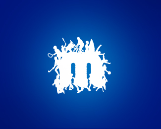
Hey Alexander, hope you don't mind my critique. I love your work and I love this concept. I'm wondering if the elements on the M are too small though. In the thumbnail size, the graphics were hard to make out and kind of blended all together. If you scale up the size of the elements and reduce the number of figures, I think this would be more effective. Your thoughts?
ReplyI would agree with OcularInk, in the thumb I thought it was an M made out scribbles. It's a really cool idea, but OcularInk has some good suggestions.
ReplyThanks for looking in Kevin and George and the comments too. I take your point re the size of the detail looking more like scribbles at thumbnail size although on reflection I think that's probably not a bad thing and why it might actually work for the design... ie the scribbled, frenetic nature of the graphic when viewed from a distance conveys a real sense of activity and motion which was not an intentional effect. So, while I would normally keep fine detail to a minimum for repro. at small sizes, I think the use of such detail in this design is one of the elements that catches the eye and makes one look closer where upon the viewer is rewarded with the discovery of all those individuals being active.
Reply%5E fair enough. I wanted to mention the fact that %22second view%22 and %22a-ha%22 effect could really work with this. Good one!
ReplyLike where its going,but too busy right now!
ReplyI see the m from m%26m's %3B) Same font maybe?
ReplyYglo... similar I guess in that hey are both m's. The M%26M font is a slab serif with a straight, serifed upstroke on the left whereas this one is customised with no serifs. Thanks for looking in...
ReplyPlease login/signup to make a comment, registration is easy