Float
(Floaters:
23 )
Description:
Logo design for proposed new wine brand.
Status:
Unused proposal
Viewed:
13081
Share:





Lets Discuss
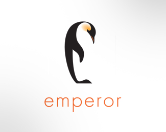
This is an elegant logo. Is the negative space, the belly, meant to resemble the shape of a wine bottle? Because it sort of looks like it.
ReplyNice mark! The curves are lovely, good job getting the E shape too.
ReplyInstant aha moment. Great job.
ReplyVery nicely drawn, but I don%B4t understand the choice of font.
Replylove the use of white space. great image.
ReplyThanks all for looking in and the floats...*Chirp - the negative space isn't intentionally meant to represent a bottle, but if that's what you're seein', great.*Neil - Thanks - the cap 'E' is the intended subtle image.*J-Caz - glad it worked for you.*Barry - Thanks for the comment - and the font? I like Futura's clarity, minimalism and weight... that did it for me anyway.*Thanks Coy - appreciate it.
ReplyE for elegant :)
ReplyHey dbunk, I like your showcase. Thanks for looking in.
ReplyThis is a great mark. One criticism... if you move the text to the right of the penguin it would balance the logo. As it is I get the feeling that the penguin is going to tip over or just a very uneasy feeling about the placement.
Replywow! simple and refined - Nice touch incorporating the E. floated
ReplyThanks for the comments Spiffy and Ashley - and the constructive eye for detail you both have.
ReplyWhoa! Nice negative space 'E'. That's a great illustration too. I'm not a fan of the type, but if you feel like it works then I'm probably just an idiot. Great job!
ReplyThanks Chad... type can be a very personal thing I guess... I wouldn't call you an idiot for not liking it - there are probably dozens more fonts that could work as well if not better. Thanks for looking in.
ReplyVow this is great mark
ReplyThanks Jan.
ReplyNice job... I like the the way negative space forms up.. Keep up the good work!! Thumbs Up
ReplyThanks for the comment Denis - much appreciated.
ReplyPlease login/signup to make a comment, registration is easy