Description:
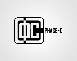
Hey guys! I'm new at this and would really use some feedback on the overall look a logo should have: composition, proportion, balance, typeface or anything else you find suitable!
The logo is based on the greek letter phi, a symbolical representation of the name (Phase - a variant of phi) of the IT firm.
Status:
Nothing set
Viewed:
1286
Share:


Lets Discuss
I likey. :-) Obviously people would need to know the origin of Phi, but otherwise the mark is nice. Kind of overpowers the type, but if the mark was ever meant to be used by its lonesome, it would certainly hold up.
ReplyPlease login/signup to make a comment, registration is easy