Polish Space Agency
by Logoflow • Uploaded: Oct. 16 '15


Description:
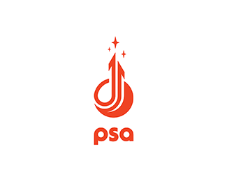
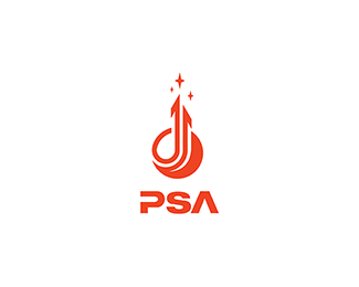
Logo for a contest for Polish Space Agency. Logo shows a planet and arrows as a 'reaching for the stars' symbol. It's dynamic but stable as well. I'd like to show that logo as a tribute to momdernism polish logos from '60, '70 which was very expresive in its form but simple and clean as well.
Images in mock-ups by Nick Kaloterakis
Status:
For sale
Viewed:
6,790
Tags:
•
polish
•
agency
•
stars
Share:



Lets Discuss
Might be trying to be to clever with the typography. Does it detract from the retro mark?
ReplyOf course, typography might be different, but I thought typography then was mostly based on classic swiss style. But I also thought it should be 'modern' because it's connected with 'space', 'discovery', 'future'. So I took swiss font and made it look 'modern'. If you had some other ideas that could make the logo better, don't hesitate to share it with me, please :)
ReplyI've laid it aside for couple days and think logoboom might has a point so I've adjusted typography in this project. Seems it's better, what do you think?
ReplyPlease login/signup to make a comment, registration is easy