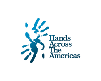
Description:
Logo for a Catholic, non-profit, volunteer mission group from Texas serving in Ecuador
Status:
Unused proposal
Viewed:
11007
Share:



Lets Discuss
cool concept...:)
Replyvery nice, clever too
ReplyClever indeed. Type needs a bit more separation from the mark IMO.
Replyexcellent concept and execution, if you take on board firebrands comment you've an excellent logo
Replygreat graphic solution. nice work.
ReplyVery nice mate. I agree, symbol and typeface need more room inbetween.
ReplyThanks guys, appreciate it the good energy. Actually the first version was like that with a little room in between, it was the client who actually ask for the proximity of the type. I made it as close as I thought it was balanced :S
ReplyThanks guys, appreciate the good energy. Actually the first version was like that with a little room in between, it was the client who actually ask for the proximity of the type. I made it as close as I thought it was balanced :S
ReplyBrilliant..
ReplyBeautiful mark. I agree with the type / layout concerns.
ReplyThat's negative space working brilliantly. Love it.
ReplyNeato!
ReplyThis is definitely one of the best logos I've seen. An amazing concept executed perfectly. **Do you have a larger resolution, perhaps?**Truly love it!
ReplyReally like this one!!
ReplyLarger and revised version here guys:*http://logopond.com/gallery/detail/96441**Thanks for all the good advises and the good energy!!!!
ReplyNicely done. Well executed concept. I would have to agree with the type comment.
ReplyVery Creative, love that concept!*-N8
ReplyVery nice concept. I like it.
Replyvery nice.*would have maybe liked to see a different hand print for each hand - to show the customization a little more.*maybe would also be nice to have a left and right hand not 2 right hands.
ReplyI think this is a nice logo. It is well executed, however as to the originality of the idea, I'm uncertain. You probably didn't see this, or the many others like it, but for example, http://togethergreen.org/ - also a non profit initiative. Overall nice work though.
ReplyNever seen that other logo... Interesting concept as well :)*Thanks for pointing that out...
ReplyNot crazy about the type, but great concept.
ReplyThis is great,subtle!!!
ReplyPlease login/signup to make a comment, registration is easy