Float
(Floaters:
124 )
Description:
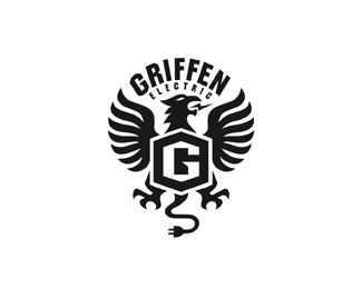
Griffen Electric = A griffin with tail and tongue conveying electrical. WIP..
Status:
Unused proposal
Viewed:
23147
Share:

Lets Discuss
Very cool
ReplyIt looks really nice Mike, just feels like the bottom type was a an afterthought. It doesn't flow in well with the rest IMO.
ReplyThanks Jerron. Ok thanks Joe.
Replyanother great one, Mike. two thumbs up big time.
ReplyLooks perfect as is :)
ReplyGood work, as usual. I think that there is no need for that plug though.
ReplyThanks guys, yeah I kind of like the break of type here. The tail directs you to electrical. I think it fits ok.*VLD, thanks but don't you think it adds a bit more personality and purpose than some ordinary crest type Griffin logo? I think the those two subtle things is what makes it unique.
ReplyFrankly, I didn't noticed the tail until I read the description... The tongue is enough IMO.
Replysolid work mike, tail is a nice touch, only grip is I would like to see a bigger bolt coming from the mouth thought it would probably unbalance it.
ReplyHmmm, the plug is great, not seeing an issue.
Replygreat subtle volt on the tongue!
ReplyVisually you can do better.
ReplyThe tail and tongue read great. Congrats, this will do well.
ReplyVisually it looks amazing. The tongue and tail are perfect. A clever twist doesn't have to scream at you from 100 miles away. This serves it's purpose perfectly.
Replywow - beautiful!**Even if I didn't have clients with 'unique strong names like this' I would much rather wish for your skills**Joe, mike is not really an afterthought kind of guy
ReplyI was just reading up on griffen/gryphon lore the other day, ironically. Thing is, when it comes to illustrating them...they have lion's paws for their rear-half. At the moment, if I didn't see the word 'Griffen' there, I may have just thought this was a falcon, or an eagle. Due to the bottom half not resembling lion's paws, but ordinary talons. Otherwise, superb illustrative work so far. Also, love the type as-is, great contrast. Don't touch the type.
ReplyJF - the hind quarters, the lion half, might be out of view as this is front on, in that case, it would make sense to depict the talons...also this hybrid is electric, times have changed since ancient asia!
ReplyThanks for the comments guys.*JF Raja's right kind of a hybrid version, but I made some subtle changes based on comments. So now everyone is happy %3B)
ReplyGood point, Raja. The reason I assume that is the bottom-half, tho, is because if where the tail/cord comes from. It puts the body of the beast almost stitting down, on its tail. As a result, the %22G%22 is the under-belly, the chest area even. What might be an enhancement to this illo is to have two talons grasping the %22G%22 on the upper corners of the crest/chest, and have the two feet that are currently drawn look more like paws. Also, because there is a lack of two sets of feet here, to make a true impact of gryphon anatomy, this creature must have both sets showing. Otherwise, it visually can only make the viewer assume a gryphon/griffin is some breed of bird. What is unseen is unknown to the uninitiated. Again, great work so far.
ReplyGuys, it's a WIP.. give me a little bit :)
ReplyLove it.
ReplySince when did a hexagon become a sextagon? %3B)**Very nicely balanced Miguel. No-one can do this kind of logo like you, apart from Vonster maybe.
ReplyTrue. %3B)
ReplyThanks Roy and everyone for your comments. I really do appreciate hearing but you know what? I cannot please everyone. As you can see I listen but every little change I make, I must change everything in the design. Thus ruining the integrity of the logo. We don't want a Frankenstien logo :) I have been back on forth on this and going to sit on this for now. Cheers.
Reply%5E Good point Roy, Mike and Von have great ability for these kinds of things. Great work, Mike.
ReplySure is a beauty, Mike
ReplyStrong mark !
ReplyThis is fantastic bud.
ReplySlayed it dude!
ReplyThis is totally bad ass.
ReplyYou are the wing master!
ReplyFantastic.
ReplyThanks for the comments and help guys. This was the original design, The angles are sharper and not as smooth. just has a different feel. http://logopond.com/gallery/detail/100463
ReplyBoth looks Awesome Mike!!
ReplyThanks Alan, I appreciate that.
ReplyLike the arrangement of type a lot better now Mike, solid work.
Replyyour work is perfect
Replynice
ReplyLove this logo. Looks like you have perfected the design now so will be adding to favorites plus floating. Great work.
ReplyAmazing. It'd be interesting to see some color on this.
ReplySolid. %22GRIFFEN%22 looks a little distorted though.
Replyanother great logo. nice job.
Replyyea I like this one, this one just seems to flow a little better.. they're both great, but you know that :)
ReplyLove it Mike!
ReplyThanks ya'll. Julian, I agree just have not uploaded fixed version.
ReplyGreat work!
ReplyJust perfect!*
ReplyThanks Mekeman and Orca Design.
Replyw o w ... !
Replystrong impression! :)
Replylook at this Mike
Replyhttp://www.behance.net/gallery/The-30-logos/3057491
http://behance.vo.llnwd.net/profiles17/490297/projects/3057491/85e1041c088cf7a049b3cdd1e2d79873.jpg
SMH, people always think they can get over
ReplyThanks Michal. it may not be a blantant rip but def. inspired by. Also check out Day 27, same concept as VLD see 6th comment here :)
Replyvery nice
ReplyThis is actually very very good. Your should be proud of this one. Really stands out.
ReplyPlease login/signup to make a comment, registration is easy