Description:
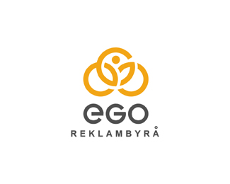
Another version for ego Reklambyra. How do you design "ego"? well using an e a G an an o this is what I came up with for ego. The overlapping circles create the ego or human aspect here. WIP.. just a idea at this point.
Status:
Unused proposal
Viewed:
17037
Share:

Lets Discuss
i like mark easy can read ego, not seems to bussy but i am not sure like or not type.
ReplyThanks contrast, I agree the mark is fine and not at all %22busy%22 I think it says exactly what I wanted it to.
ReplyI'm liking the mark. Inter connectivity and humanity with class is what it says to me. Something about the text Reklambyra seems slightly off, but I can't think of a way to do it any better.
Replyrly good logo!
ReplyThanks snowkai.
ReplyCool logo dude ... The mark works on quite a few levels twisting the holistic connotation back on itself
ReplyThanks Big Mike:) from Mr Ego
ReplyVery nice mike :)
ReplyThe 'human aspect' you wrote about, after taking a closer look it is easily observed. What I see there is a man, holding his right hand up and pointing with left to his chest, like he is giving a speech, perhaps boasting about himself / his achievements. It could not have been done better.
ReplyThanks Vernics and Myob, yeah I see he kinda has his chest puffed out :)
ReplyHey Mike, diggin this one, very cool mark. (Small question, type shouldn't have the same endings as the mark? it would be connected more, just a thought)
ReplyThanks Milou, I will def. look into that. Working on a new one.*This was the first one. http://logopond.com/gallery/detail/43585
Replysweet, Mike. both this one and your first one.
ReplyReally great work, love it.
ReplyAll class Mike. Nice work.
ReplyVery nice Mike, what do there do?
ReplyI love it, I agree about the endings of the typography thats the first what I thought too. would fit more if they were a bit more edgy and not that soft. imho
Replysuperb work, Mike! *i like the symbol, it's so expressive. *maybe the 'ego' type can be refined a bit. also the tagline kerning, because somehow it distracts attention from the icon:)
ReplyThanks a lot guys. I'm uncertain about color but have changed the type endings for you.
ReplyLove it, Mike
ReplyBtw, what does 'reklambyra' mean?
ReplyThanks Siah. Myob means Advertising Agency in Swedish.
ReplyAnother good one from you Mike.
ReplyThe ego has landed. :) Good work!
ReplyThanks cseven.*zephyr, ha ha need a couple more before one lands :)
Replylovely mark Mike! The word ego and the mark perfectly match in line weight and style perhaps too well. Perhaps try reducing the size of ego.
ReplyThanks Lefty. Thanks Muse if I reduce the mark the line weight would be even closer. Plus I believe Raja said %22Make it bigger%22 :)
ReplyHey Mike the previous one is also great, two winners for two concepts, I'm curious what you will come up with in the next one :-)
Reply%5E Thanks Milo, I'm curious too :)
ReplyMilou*
ReplyLove the clean style, very neat.
ReplyThanks Cresk. Milou well,. here is my next one :)*http://logopond.com/gallery/detail/124844*
ReplyYou are a logo Monster. Class stuff Logomotive.
Replywow, the guys have so many well designed logos to choose from!!
Replyi like it!
ReplyThanks guys, this one's finally wrapped up and put to bed.
ReplyLOOK!! Tabitha found another. You all should hire her.
Replyhttps://www.facebook.com/AcademiaGymCenterJardimCamburi
LOL Mike
ReplyThe nerve...
Reply@tabitha: Having fun with the Google search by image tool? ;)
Yep. I do it with mine all the time to keep up with theft and offered to do it for Mike too. :)
ReplyI know it sounds funny but it's not. I thank Tabitha for pointing it out again. Something, I mean something has to be done about this.. Just not sure what or how. Any GOOD lawyers out there reading this might find it intriguing.
ReplyUnfortunately when we are talking about design theft on an international level, its very hard (almost impossible)to police. If you have officially registered your work, then you\'ll have a very high chance to win your battle in court if it ever gets to that stage. Any good IP lawyer will just give you the same spiel when you present this case to them. But I think what you\'re really talking about Mike is if there is any way to deter actions of theft right from the start. Yes, there is one way. Do not expose your work on the internet. Simple as that. Because once it is out there, regardless of whether it is illegal or not or until proven otherwise, there will be someone more than willing to steal your work. You can catch one and make an example of him/her to the world, but like all thieves through history, they evolve. They will only get smarter the next time round.
ReplyFor those of you that haven\'t already read it, this article provides a very thorough insight on what you should do if it happens to you. Cheers.
http://designshack.net/articles/inspiration/what-to-do-if-someone-steals-your-design/
Another great search tool to see if folks are ripping you off: http://www.tineye.com
ReplyI started out with tineye but, having to upload my photo or enter a link got too annoying for me. That\'s why I like the Google Search by image add on for google chrome. I just click the little icon on the photo and it searches for me. Do I sound like a commercial for this thing? ahahaha
ReplyYou know, I never thought of getting an add-on! And I never use Chrome. Do you find Chrome to work with most sites?
ReplyHey very good!
Reply@vigo85 Thank you
ReplyPlease login/signup to make a comment, registration is easy