Float
(Floaters:
63 )
Description:
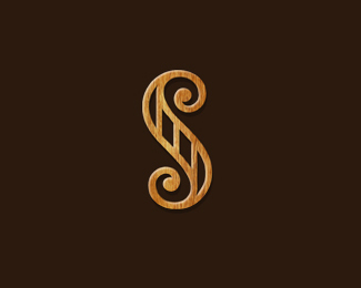
S mark logo created for Co. that builds staircases.
Status:
Unused proposal
Viewed:
6613
Share:




Lets Discuss
elegant staircase mate... It reminds me old bungalows.
ReplyVery nice, Mike.
ReplyMike, thumbs upstairs!! love it!
ReplyStrong S Forces me to reflect on the eternal
Replygorgeously appropriate
ReplyThanks for the Stairs guys :)
ReplyWow, really speaks to craftsmanship and quality. It feels like it is leaning left slightly, or perhaps slightly top heavy as an S. Great work!
ReplyThanks Lumavine I know what your saying I went back and forth on this...Stand on your head and look at it and get the same result :) I just wanted the staircase to be accentuated and wider the beginning and to convey the scroll work and beginning and ending of staircase.
Replystrong mark Mike nice job
ReplyNice indeed, mike.
ReplyThanks Ceris and the new Sean Hesler :)
ReplyHeisler*
ReplyI think this stuff is usual from you, but original to us. Great work!
ReplyHey Mike, am I mistaken remembering you designed this a while back? Maybe you posted something similar in B/W? Love it in any case :)
ReplyThanks Matto. Yes Michael, I do believe I posted it here as a WIP,it was too classical for client. Good memory.
ReplyTheir work is more modern.
ReplyYeah I thought so. Liked it a lot in B/W as well if I recall %3B) Classically modern I say.
ReplyOoh, very nice.
ReplyThanks Michael and Chad.
Replybeautiful S mike... execution is flawless.
ReplyStairy good!
ReplyCheers fellas.
Replybeautiful..
ReplyPlease login/signup to make a comment, registration is easy