
Description:
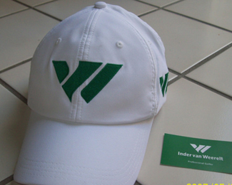
The logo is designed for a pro golfer. Monogram representing clients name, an I a V and a W. Managed to use the negative space using 2 irons (golf clubs) He really liked the mark.
Status:
Client work
Viewed:
9531
Share:


Lets Discuss
dig the mark mike
ReplyThanks so much Nitish. I really never thought I could get all three letters to work without looking like VolksWagon or Tiger woods, but happy with the results.
Replythis is great, man.
Replyonce you see the clubs, it's a treat
Reply%5Ewhat he said. awesome stuff. not sure about proportion nor the type tho (especially those e%60s).
Reply:) not being fussy with the type now. I found one that is condensed and bold enough. I could compliment the mark precisely,.. but would lose the fact of where and how this logo is going to be used. Happy medium here. Thanks guys
ReplyFeels timeless
Replydropping the circle is a good call. This is turned out great.
ReplyThanks Richard.*Paul I agree, just hope he wins the PGA someday :) here's a mock up of the logo how it might fit on a ball. http://dribbble.com/shots/109341-Golfball?list%3Dtags%26tag%3Dlogo
Replyyeah I was just looking at that on dribbble. good stuff mike.
ReplyBrilliant!!!
ReplyThanks again Paul. Thank You Rudy, client just approved it.
Replyyou're a machine
Replylove it :)
ReplyThanks Cerise and Tabitha.
Replywaiting for my new hat and golf balls :) http://indervanweerelt.com/
ReplyI think this one deserves more recognition Mike, beautiful solution.
ReplyThanks a Lot Rudy. It means a whole lot to me.
ReplyHOLE lot :)
Replyagree with rudy here, this is a great piece
ReplyThanks again dotflo. I was stocked it all worked out and client understood and liked it. Does not always have to be in your face clever/cool.
ReplyStoked!
ReplyLooks good on hat http://www.golfsupport.nl/index.php?module%3Dfoto%26foto%5Baction%5D%3DlistItem%26foto%5Borigin%5D%3Dhome_event%26foto%5Bfilter%5D%5Bevent%5D%3D1392%26
ReplyJust received another Pro golfer Gig from this one. :))
Replyoooooooo....what's his/her name? or can you not disclose that info yet?
ReplyTiger Woods! JK
Replyif that's the case he really is making some changes...swing coach, caddy, wifey and now logo design? whoa!
ReplyAwesome Big Mike. Would love to have one of those hats. maybe my game would get better......Na! My game would be the same, but I'd look good. :D
Replyman ... what an amazing logo ... best ID work ... ooops ...I did it again ...... ;)
ReplyHa ha Colin, just read your message.
ReplyMikey, They are good hats too. See if I can get ya one :)
HA Thanks TAS, It is one of my personal favs. however.
HAT! Damn, Mike that would be fan frickin'-tastic.
ReplyAnything to help your game :) Trying to get some Green hats with white type like this .
ReplyVery nice logo, don\'t see the i though. Negative space is perfect.
Replyin love with this. :)
ReplyThanks Durand, well maybe a bit abstract, but it's in there ;)
ReplyJulius Thanks buddy, I like the simple hidden aspect of it the most.
Still brilliant!
ReplyThanks again Gareth :)
ReplyDoh, I\'ve only just hit the green. Just spotted the clubs! Nice one Mike.
ReplyYeah, the monogram alone is beautiful, then on closer inspection... \"The golf clubs\"! Brilliant.
ReplyReally Roy? It took you that long?
ReplyThanks Dan, too so subtle I guess.
double bogey for mr. smith.
ReplyWell Mr Smith has a few Birdies in the whole so I forgive him :)
Replyhole.
Replyperhaps a few eagles as well.
ReplyWell Yes in That sense, I was referring to his actual portfolio :)
ReplyThat cap turned out great, Mike!
Replyme too mike.
ReplyJust being literal. Yes many Eagles(aces), but a few birdies too.
ReplyThanks Alen, Trying to get one for Mikey.
Holy cow! Thanks for the link Tabitha. http://spvideowall.files.wordpress.com/2012/01/asd.png
ReplyYou\'re very welcome Mike. My pleasure. I\'m always happy to help. :)
ReplyThe nerve. Kick their ass Mike. Nice catch Tab.
ReplyFinally made it into the gallery, I\'m glad it\'s recognized as it deserves to be Mike.
ReplyHey Mikey! What color hat do you want. Green logo on Black hat or green logo on white hat? Shoot me your address.
ReplyThanks Rudy, Norm and Tab!
ReplyOH MAN, MIKE you kidding me. love one. I\'ll email ya right now.
ReplyI\'m thinking green on black. SWEET
:) Ok good with me cause I like the white one best. I wanted him to do green hat though.
ReplyDidn\'t notice the hat photo before. It looks awesome on that hat!
Replyagree, dark green would be nice.
Replyalso really like the white, just gets dirty faster on me, cause I\'m always off in the woods and other rough looking for my ball. HA!
Thanks Tab, I can honestly say, I like it more than Tiger Woods logo but I'm just biased.
ReplyMikey, yeah green would be perfect IMO but I will send you a black one. I know my white one gets pretty grubby.
how could I have not seen those clubs? @#$#%^
ReplyBrilliant as usual Mike!
dont worry raja i am just now seeing them to O.o
ReplyWhere ya been David and Raja? ;)
ReplyThanks Mike. You have a few Double-Eagles too
:) Three Blind mice!
Replyhaha
ReplyRoy, did some work/travel/life things, time is now split in half :|
Mike, saw the website, your logo looks really nice on there too
Yeah I know how your life gets split for sure. Thanks Raja. They did good I think.
ReplyLoving the colors and use of the clubs. Excellent work.
ReplyPlease login/signup to make a comment, registration is easy