Description:
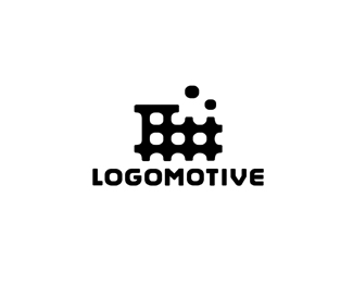
I'm pretty sure this is going to be my new Identity. I really like it so far and that's what matters most I guess. The mark is shaped like an L, and train tracks forming a train. The smoke can be conveyed as thought bubbles.
As seen on:
www.logomotive.net
Status:
Client work
Viewed:
36457
Share:

Lets Discuss
a choo-choo train?
ReplyGrate! Have you tried the smoke in the same shape as the holes?
Replynice.. good suggestion Roy...
ReplyOh, it's a track too.
Reply%5E %3D) I'm wondering what I could use this for. Yeah good idea Roy, this still needs some tweakin.
ReplyAll I can say is Bye Bye Duck!
ReplyWahaay! I think this much stronger than the cowcatcher.
ReplyOH yeah and besides that was not sitting well with me. This IS I'm stoked!!! and feeling good with this one.Thanks for your vote of approval guys. %3D) I'm a happy camper today.
ReplyYeeeah Mike great mark!! I%B4ll miss the Duck
Replyhow about the duck popping it's head out of the train? :P
ReplyMakes perfect sense...it's sooo you, Mike :)
ReplyAlan and George, Shhhsssh! Mike will only get sentimental again.
Replywell in that case, how about strapping the duck to the front of the train?!
Replygood point roy!! :/
ReplyClever. And I agree with Fogra that it actually describes your style well.
ReplyThanks guys, I'm soooo happy. I finally after all these years have a mark I can be content with. Now just gotta fix my site %3B-P
Replyit is good as is, but I might suggest simplifying it further by taking out the middle horizontal line. extend the left two vertical line up through the roof and leave the rest as is. just curious to see if it would still look like a train.
Reply%5E Thanks Trish but I'm pretty content right now.I've thought about this for 13 years.
ReplyFor a 2c version the middle three squares could be coloured up the same as the smoke. How about a font like Neo Sans for this, Mike? Sorry to keep poking my nose in but I can't get enough of this logo.
Replyits amazing, i love it, great mark for a great guy - superbly executed mike!
ReplyHa lottsa puns! Thanks guys.*Roy I don't want to lose the track aspect. I'm close but consider all suggestions, except adding duck. %3B-P
Replythis is really great! i like it a lot. is perfect as is, one thing you could play with if you wanted to would be to somehow size the type so the o's read as the wheels of the train?? i don't even know if that would be possible because the front end of your name is more 'O' heavy than the end, so it might look unbalanced....but seriously this is really awesome. nice job!
Replythis is surely better than the cowcatcher! i think this could become very strong mark. only if the two %22bubbles%22.. :)
Replyim pushing the boat out to really make Mike happy... hey!.. the whole logo looks like its made of L's %26 M's!!...**%3B)
Reply%5E ha ha good eye NAV meant to do that. No seriously,.. with all the duck bashing it's nice to hear.
ReplyCentered bubbles is a good tweak, makes it simpler and more cohesive.
Replysweet mate, thats a nice mark! Its big plus that you are happy with it, i'm not even sure if i like my own tbh!
ReplyThats it. Superb, Mike.
ReplyAwe, look at you, bud...all grown up. The mark looks fantastic! Need a little more custom action on the type though. That's like one of your trademarks. Nothin' too crazy, but...ah, who am I kidding? You know what you're doing!
ReplyFirebrands point on smoke in the same shape as the holes was right. Turns logo into Mikes Mark. Congratulations on that.
ReplyCongrats, Mike! :)
Reply%5EThanks Bubbles smoke and all I'm grinning ear to ear. thanks guys.*OC yeah not sure if it will stay but might extra fine tune it. Thanks
Reply...and where to put the TM?... hm, hm, hm... :)
ReplyYes.
ReplyVery cool memorable, distinctive
ReplyI like it... very much Mike, You should be happy, Nice work!
ReplyThat's the one Mike - it fits with the name and is clearer than the cow-catcher. Great one!
Reply3 wheels %26 3 O's interesting
Replymaybe the TM should be by the far right, in line with the lowest horizontal?
ReplySick MikeE! Just plain sick!
ReplyTHANKS! coming from all your respected designers it makes me feel even more secure that I have Finally arrived at my own mark.
ReplyIs the typeface final though ?
ReplyBrilliant my friend!
ReplyAwesome and majorly cute. It has such a friendly look!!! Suits you to a T Mike. Can't wait to be sent a business card :-D
Replywow, 13 years of patience always brings great result. :)*awesome man, just awesome.
ReplyIt's very nice :) So, what happens to the duck? Will there be a goodbye party? Are we all invited? I'm sure he knows how to party
ReplyOh, cookie crumbles finally i see :) I am glad for you Mike! No, wait, I am waffled %3B)
ReplyTie the duck to the track and run it over...all aboard the train %3C3 it
Replyvery nice
ReplyHi Mike,**long time no speak - looking good this! very memorable icon. i love the duck though :'(
Replylooks great Mike!
ReplyThanks for all the positive comments guys. Now that I have my mark i have been excited to get my site finished. I posted for opinions in the forum here http://logopond.com/forum/viewtopic.php?id%3D3177 Thanks again guys.
ReplyThanks Dalius, I can honestly say probably can go in my top 5 favorite marks that I have designed, well right after my ducky.
ReplyGreat work..no more ducky then right?? :)
ReplyThanks Terry yeah no more duck.*CD thanks, I awarded myself by designing this %3D)
ReplyAwesome! Really nice job man! :D
Replyperfect!
ReplyWow I like this one the best out of all of them. Clean, recognizable, and simple. I would say that you definitely have a winner here. Nice design Mike!
ReplyThanks guys. I would like to add my thoughts without sounding arrogant, considering I do not blog or redirect people to my site, and only doing this to help younger designers and any that will have an ear. This was a fine case of of the most extreme measures taken to achieve the final results. If I make the circles too round I lose the train tracks. If I make it too square I loose the wheels. The subtle touches here should be closely observed. It's the fine detail in design that can make or break a logo. This was by far my toughest project yet my most satisfying one to date.
ReplyNice way to unleash your logo just around the corner of your birthday! A memorable mark indeed!
ReplyI haven't felt this way since Obama got in... Nice work Mike %26 congratulations.
ReplyNice work Mike :)
ReplyI choo choo choose you!!
ReplyBye bye cowcatcher!*
Replyvery nice Mike! The duck as dead as a dodo!
ReplyA clever design yet a little harsh. Maybe try to soften it a bit with a more rounded approach to all of the corners.
Reply:: Now you can change your avatar! :D, perfecto!
Replybravo
ReplyI'm surprised nobody has suggested this yet: Flip the train horizontally so it's facing left.*The benefit is that now when the logo is rotated clockwise, the train becomes a letter %22L%22. Perhaps the train is already supposed to be an %22L%22 with a short stem? Either way it's a nice logo.
ReplyI don't mean to burst your bubble, but to be honest I didn't see the train until I read the comments but after seeing it it was one of those aha moments... I like that in a logo. You should be proud :) Look forward to your new website too!
ReplyCongrats, mike. There is no one client more difficult than yourself. I think you should both be happy (you the designer and you the client). :)
Replycongrats for your new logo!! i think is great!!
ReplyLove it, Mike! Saw the concept right away. I like the thinking behind the though bubbles, too. Keep chugging man. Can't wait to see your new site.. %3B)
ReplyWow! Way to go Mike, suites you perfectly! I love it :)
Replybeautiful, balanced and just memorable!
ReplyHOly Cows! i scrolled a long way down just to say. . . great mark! It's about time you ditched the duck and updated your site! **Talented mark from a talented designer. all the best.*
Replyway to toot your own horn, see what I did there.. lol, great execution..
ReplyArriving very late to this discussion ... This mark is perfect just as it is. Don't make the thought bubbles, this here as it is, is perfect! Saw the train and everything right away ... saw the tracks too. The type is nice and strong, a little play on the words %22Logo%22 and %22Motive%22 %5Bdifference in font weights%5D could just nail it and set it in stone I reckon :-)**Kudos Mike!
ReplyThanks everyone. I'm overwhelmed and humbled by all your support.
ReplyGreat work Mike!!!! I know how hard it is to make your on logo, and this one is perfect for you!
Replybrilliant, really like it. good work would of thought you may have played with the train idea alot earlier? good stuff
Replylovely rebranding logomotive!
ReplyI like the simplicity of this.
Replymuy bien, ya era hora de una renovacion, felicidades! buen redise%F1o, good work!
Replyreally strong mark, would almost definitely leave a lasting impression, and if you are happy with it, thats even better, I've struggled with mine for such a long time I thinking of renaming myself 'the man with no name/logo'. Well done, another logo success to add to your impressive portfolio.
ReplyThanks for your comments and support guys.
ReplyBrilliant work.
Replyvery nice Mike! rare that a designer can please himself...us liking is just gravy!
ReplyThis is amazing, Mike!!!
ReplyThanks guys, I've actually been using this new logo on some of my proposals and questionnaires.I'm liking it a LOT. It even has hints of hole punch outs like the conductors use when validating your ticket.
ReplyVery nice!
Replyclever idea
Replymike, i concur with all above positive comments! **I beg you to do us all a favor and update your gravatar icon to your new logo, please oh please?**It has always made me cringe seeing that duck icon out to the side of a talented designer with the name 'logomotive'. it'd be hugely refreshing to see a fitting (not to mention, exceptional) logo from now on when I see your comments %3B)**
ReplyThanks Darrel,albyantoniazzi and thanksPaul, will do ASAP.*LOL at the Fake logo upload thing. Are you kidding me? what a joke. OH this is a REAL LOGO for a REAL client, guess some people will be happy now and feel they are better designers cause they are uploading REAL logos LOL.*By the way I uploaded with %22custom%22 type as per Kevin OCs request. The logo now has some old fashion merged with some modern style. Thanks again guys and keep uploading those inspirational FAKE logos.
Replybrilliant
Replythanks T%F8mme *
ReplyIs this typeface final ?
Reply%5E Yes it is.
Replylooks great as a gravatar icon. no more duck, woohoo!
ReplyWow, you're my idol. Definitely
ReplyThanks Paul yes, no mas. Thanks wannabe %3B-)
ReplyThis is absolutely great. I am new here and I always wondered why the logomotive guy with such great logo submissions had a random duck logo/avatar. This is a perfect creation for you. Great job.
ReplyThanks Linkcreative, The Duck actually worked for some strange reason. Probably because it was controversial. Why? people remembered the duck. But I am glad I arrived at this mark. It is perfect for me.
Replylove it, very memorable too!
ReplyThanks Alex.
ReplyNot to go floating my own boat (train) but everyday I find another reason to like my brand even more. That middle space of a train is called the Boiler, the Fire creates steam. So those are Steam bubbles on the inside and smoke or steam (thought bubbles) coming out of stack. :)
ReplyEvery right to go floating your train.*%3C Even at favicon size it works brilliantly. Umm I wonder what can I do with my initials in black and white?...
ReplyThanks Roy, well.. let's get on it. Have you nailed it down? your name? Surely you'll figure it out sooner than I did.
ReplyCheck your firebox. %3B)
Replyoi!... i wana see it too!
Reply%5ENowt to see yet mate. I haven't started yet, I'm gonna get you and Mike to do it!
Replyvery nice work :)
ReplyThanks Toni, maybe I should just Duck it.
ReplyTrain, train tracks, wheels, smoke, wordplay, abstractism, monogram, and here n there the mark forms all the letters of %22LOGOMOTIVE%22 definitely on the RIGHT TRACK :)
ReplyHey Mike, this is as strong as your showcase, I like it a lot. Visited your site and found that is a bit too out-dated, with the ducky still there? Also i was a bit confused with Jeff Fisher's Logomotives (which I've know for years). Just wonder if you were to register this what would happen.
Reply:)Thanks dbunk.*Thanks mrsunnyz, yeah we have known each other for many years also. If and when I get it registered i would add the %AE. I see no prob there.
Reply%5E Thanks ThisGuy, where were you the last ten years? Is that a hint of how bad it sucks? yeah I know. I have a great web guy working on it now. I did that in Front page in 98 and have not updated since :) Thanks for the offer and will keep you in mind for future prospects.
ReplyAfter so many time from the first time I've seen this mark... just can't stop comming up here to see it again! :D
ReplyHey mike! I have an art presentation to do within this next week (College. Good times.) where we have to critically analyze some pieces in an acclaimed graphic designers showcase. Would it be alright if I showed you off to my class? I know it sounds pretty kiddy, but I thought it would be best to ask before gallivanting off on essay topics.
Reply@This guy, Thanks for the offer though.**@dadado, Thanks keep coming back anytime %3B)**@ Chad, I'd be honored and thanks for asking.
ReplyI couldn't even get through a game of 'Connect 4' with out thinking about you dammit. I have been hit by a train - good brand power bro!
Reply%5E I was eating a box of cereal and trying to get through the maze on back of box and could not get through without thinking of you. A Mazing brand bro. %3B)
ReplyI thought I would let you know that someone has submitted a %22helafant%22 to Brandstack. http://brandstack.com/logo-design/details/14058
Reply%5Eha funny stuff.
ReplyWonderful *personal logo!
ReplyThanks fourplus, I'm very happy with it.
ReplyNice job. This logo makes me hungry for waffle fries!
ReplyCrap. Now I want Chick-fil-A. At least it's not Sunday.
Replymmmmm chic-fil-a.... unfortunately there's one right by my office
ReplyHa ha, thanks guys but go here for Chicken http://logopond.com/gallery/detail/92491
Replyvery good..%0D*creative
ReplyThanks John, I must say I'm pretty proud of this one in particular, took me 13 years.
Replybeautiful
ReplyI hope to get my personal mark to this level of quality and creativity. One my favorites on the entire site!
ReplyThanks WKOA.*Thanks so much kman, like I said before this one took me a while and very satisfied with the results, and i find it even more gratifying that it is well liked.
ReplyAlways been one of my absolute favorites Mike! :)
ReplyThis is like teaching logo crafting. :)
ReplyThanks Michael and Lecart.*Since cats kinda out of bag now,..even though I'm not finished thought I should say Duck is gone now. Still lots of work, so won't be around here much but this is what is going so far. www.logomotive.net
ReplyLooking good so far Mike, keep us in the loop!
ReplyThanks Alen, surely will.
Replyyeah...website's coming along nicely Mike :) let's us know when it's at the station.
ReplyThough keep a copy of the Duck version of the site around, just so that people could appreciate the majestic scale of the site transformation :-)
ReplyThanks Josh. @epsilon yup part of my very first blog in fact www.logomotivedesigns.com the transformation. coming sooon.
Replywebsite looks great Mike... some great logos there.
ReplyThanks Paul.
ReplyI don't have a clue to what I'm doing as far as technical goes with Blogging and have a lot to learn there. But this is my very first Blog ever. http://www.logomotive.net/blog/ I'm sure it will improve.
ReplyBeautiful website mike, was about time... It really is great, and i am sure it will attract some great clients.
ReplyWebsite is looking great, Mike, look forward to your blog posts once you get into the swing of things.
ReplyThanks Alexander and Euan. I always wonder how people find the time %3B) I'll do my best though.
ReplyCongrats on site and good luck with the blog Mike!
Replyyou are amazing :P CONGRATULATIONS .
ReplyYou know he is a head master of this school :)
ReplyIndividuals considered to be more abstract, more complex
ReplyThanks guys, getting ready for Letterpress on this one :)
Reply%5EI'm sure she'll be a beauty off the press! Make sure to get us a shot!
ReplyJealous!! Letterpress is fantastic!! Definitely show us once you're finished.
ReplyHa... %3Ca style%3D%22text-decoration: underline%3B%22 href%3D%22http://logopond.com/gallery/detail/102442%23epsilon_200335%22%3Eit must be a Letterpress month%3C/a%3E ? :)**What are you making? What stock did you pick? Common, dude, tell the juicy bits...
Replyletterpress will look fab on that locomotive, any chance of a behance presentation my good man?
ReplyThanks guys, I will definitely share.*@Gravitart, Yeah In fact one of my thoughts was to %22punch out%22 the negative space kind of like a conductor punches out your ticket. But decided Just Letterpress the mark and keep it simple.
Replyi like the concept how the dot matrix become a locomotif.. very nice artwork :D
ReplyThanks Biebo. *For the record I have been accused of copying someone others idea in regards to the name Logomotive. No names mentioned here but what I can say is I was the FIRST %22logo designer%22 with an online presence on the WWW using this name. I did my research prior to this and found NO public records of anything published in print prior to my name and site. SO please do your history before accusing ME of anything like that. I had to get this off my chest.
Reply%5E The Politics involved is unbelievable.
Replythis logo is... WOW!! *_* I'm speechless
ReplyThanks Buddy :)
ReplyGreat concept and execution :)
ReplyThanks a lot davishama.
ReplyDidn't know where to start—granted, all your logos are quite exceptional—so I figured commenting on your personal mark's page was only logical. I just wanted to say, I'm a huge fan of your work. Curious to see your process work. Thanks for being awesome!
ReplyThanks for your nice comment Romeo.
Replywooooooooow
Replyi love these multi perspective ones. 'L', train and tracks all in one. genius!
Reply%5E%5E Thanks! Pretty happy with it myself :)
Replyexcellent work!!!!I love it!%7E
ReplyThanks Brandsight!*I've been agonizing over my business cards for a while now, just as I did my new identity. Here is one solution I have worked on. http://dribbble.com/shots/199512-Logomotive-Card-1?list%3Dtags%26tag%3Dlogo
ReplyBrandinsight, sorry.*
ReplyThis is exceptional, along with the rest of your logos. I'm blown away by your showcase.
ReplyThanks Brandsirrah and nickhhood for your kind words.
ReplyOne of my personal 6 best logo designers personal logos. 100%25 unique, distinct, charismatic, real brand. I like Sean O'Grady/Fogra, Michael Spitz/M, Roy Smith/Firebrand, David Pache/H, Sean/Brandclay, too.
ReplyThanks a bunch Jan, That is a great list of personal marks.
Replyrailroad mark ... great
ReplyAmazing folio man:)*Big fan of your work!:)
ReplyThanks T%26S. Thanks Ivaylo, appreciate it.
ReplyPerfect.
ReplyThanks newIdea. Works for Me.
ReplyAll your pure designs would be very welcome on logomilk.com Mike!
ReplyWishing you continued success.
Hey Thanks Rich.Wishing you the same, Looking forward to seeing it live. Keep me posted.
Reply:) Thanks Scorpy!
ReplyChoo choo. Mike Express, coming through.
Reply:) Just passing through...
Reply"i'm pretty sure this is going to be my new Identity." still contemplating mike? one of my all time fav. logos.
ReplyThanks Colin :),.. No pretty much it now, more than my duck :) You have a pretty god one yourself.
Replydo you have a link to this duck? i don't think i have ever seen it before.
Replyhttp://www.kreativegarden.com/2008/09/25/30-plus-creative-logo-design-gallery-for-inspiration/ SHHHH!
Replyoh wow. don't worry, i won't tell.
Reply:) don't worry I got riDUCKuled for years!
ReplyI have totally forgotten about your duck Mike! i remember it was a well crafted one, wasn't it? but yeah your "new" one is way better!
ReplyI agree^ Never change this again Mike, you are BRANDED with this one for life because it's so good.
ReplyThis is the logo that inspired me to design logos myself. One of my all time favourites. :)
ReplyThanks for the awesome comments. Took me 13 years, so I don't think I'm changing it anytime soon.
ReplyIndeed, this is a great mark!
ReplyThanks Scorpy and Husac.
ReplyI just realized I live about 15 minutes away from you.
Replywhere abouts?
ReplyOn 65th just south of Sac State. Ive been living here for the past two years, but Ill be moving back to San Diego in a few weeks. It would be nice to meet you before I leave!
ReplyI know where that is Just off of I 50. Yeah shoot me your Ph # maybe we could grab some lunch or something.
Replylove your work:)
ReplyThank You Klarrita.
ReplyI did this logo with no grids or circles. ;)
ReplyNo way! You're such a liar Mike. =P
ReplyToday we have these cool tools. Round corners,space, and align. ;) if it looks good I'm done.
ReplyYea. I've NEVER done the crazy circle grid thing. I feel like I need to do it at least once as a rite of passage or something lol
Replyit's a bunch of fluff! yeah I said that.
ReplyAll you need is the eye of a true designer.
Reply^ like.
ReplyLove this logo.Kudos!
Reply(y) Me too. Thanks Paulogo.
ReplyJust brilliant work
Reply^Argh...he's alright ;-P
ReplyThanks Secondseight! Thanks Norm. :P
ReplyReally nice work!
ReplyThanks Savic
ReplyWhy are all My Comments gone???
ReplyI have noticed that too, just the other day on the RockStar logo your comments had disappeared and, leaving Kevin Burr looking a bit silly.
ReplyWas My comment Relevant?
ReplyWhat the hell
ReplyNice idea & logo... is perfect!
ReplyWow, 7 years ago. Great convo. Good times
ReplyPerfect logo.
ReplyThanks Vadish and Sam. Yes Roy thanks for your suggestion, it was icing on the cake.
ReplyThis logo has been commented on every year since its upload, sign of a great mark.
Replyperfect
ReplyWow. My logo is even Registered now. UGG http://trademarkalertz.com.au/trademark/1668730-smokesexpress-tobacconists
ReplyHey Mike,
ReplyI hope you're doing well and busy.
Wondering if you or anybody is attending to the LogoLounge @ Chicago! on May 4, I kinda like to check it out but I would love to meet anyone from Logopond.
Anyone?
@rudyhurtado I'm trying to see if logopond can officially attend a few conferences next year, stay tuned.
ReplyThanks @rudyhurtado, Most likely will not as I have never been a Logolounge subscriber, but sounds like it would be a lot of fun to finally meet some of you guys.
Reply@ClimaxDesigns it would be great if logopond can do that, I'd definitely be there.
Reply@Logomotive yes it would be great to meet some logoponders in person for sure, just imagine the conversations there would be :)
Is this LP's longest thread? Man, had to change batteries on the mouse just to scroll down here ;-P
ReplyOnly have one kidney left so can't sell that. Have fun whoever's goin.
lol it might be ima have to check
ReplyI would love to check in... will see... if i catch some cheaper flight (damn those last minute flight prices...)
ReplyHey Bojan, that would be great, I'm organizing it myself, it would be a nice weekend getaway for me and hopefully meet some of you guys if you get to be there, let me know and I'll send you my cell number.
ReplyAnyone else?
I'd go in a heartbeat if I could.
Replyc'mon mike :) I just showed in 160$ only for damn visa (which i dunno if I'll get at all :) not to mention the airtickets from Serbia :) @rudyhurtado I'll know in few days if my visa got approved. Lot of people to see in Chicago :) @OcularInk @raja @bartodell @brandclay @Siah-Design you guys are not too far (at least by my standards :)... it'll be nice to meet... @ClimaxDesigns you comin'?
ReplyI cant to this one, but im trying to plan for joining a conference or two even if only as a sponsor next year. I'll be at those.
Reply@logoholik it would be great to hear you're coming, I'll make sure to be there as well, although it's closer @Raja and myself are in Toronto, I know @Siah is in Alberta.
Reply@ClimaxDesigns That's good news, I would like to be there for sure next year.
@LumaVine is in Illinois, but haven't heard from him in a while...
ReplyToday is LogoMotive's 20th Year!!!
ReplyCongrats Mike! Keep rockin'!
Reply@mistershot Thanks
Reply@logoholik Thanks, U2
ReplyIt looks really awesome! I love the simplicity in it and all the meanings and hided messages that it has. Great job!
ReplySo modern and abstractive. I like it!
ReplyPlease login/signup to make a comment, registration is easy