Description:
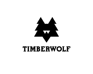
Local High School is the Woodcreek Timberwolves trying to figure out how to add a W into design naturally. The Mark is Timber Trees and a Wolf.WIP..
Status:
Nothing set
Viewed:
4651
Share:




Lets Discuss
You mean mark over type? It's centered.
ReplyThe concept is nice, Mike. I think you can push it a little further. I guess I imagine this with more detail. Perhaps with a nice wood cut feel to it?
ReplyThanks Oc, yeah It could probably accept more detail but I kinda like the simplicity in it. One way I test my designs is to ask my kids, They said %22I see a fox and, a tree and a wolf and a tree%22 so if 3 (8) year olds can see it I feel most will see it? kinda bland but I have worked on various designs for the School.
ReplyI really like the way it looks. The type is interesting too.
ReplyOh what big talent you have%3B)
ReplyThanks Tass and Fabianhood .
Replyyo mike, great work as always.. What about spreading the top triangles, sort of make them ears off to the side in case making a more ledge able W..? *can't wait to see this WIP
ReplyI caught your second version first %3E sweet! And now I see you had an excellent starting point... Super solid, that's all there is to it! A damn fine mark!
ReplyI like your color version of this logo, but I love how this one looks like a wolf wearing sweet 80s sunglasses, at least thats what I see for some reason. Anyway nice logo. So many mascot logos are all the same kind of illustrative style, I like the simplicity of these two.
ReplyPlease login/signup to make a comment, registration is easy